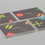
Thanda by Karoshi
Thanda is a luxury home accessory business bringing high-end artisanal products crafted by people in South Africa to the UK market. It does this with the intention of helping to support local communities, promoting ecological awareness and proving that sustainability does not have to compromise aesthetic. Thanda worked with London based graphic design studio Karoshi to articulate and express this positioning and the...
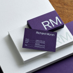
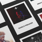
Richard Moran by Journal
Richard Moran is a lifestyle and portrait photographer with over 25 years of experience. He has worked with international businesses such as GSK, Pizza Express and Grey Goose Vodka, and secured a reputation as a passionate, straight-talking professional with a meticulous attention to detail and a portfolio of high-quality and emotive work. With a desire to communicate this and with the intention of...
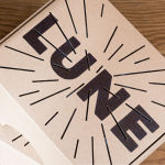
Lune Croissanterie by A Friend Of Mine
Lune Croissanterie is a Melbourne based bakery dedicated to the craft of Viennoiserie. After gaining a cult following and amassing long cues it quickly outgrew its small shop and moved into a larger warehouse space in the suburb of Fitzroy which features a distinctive interior design by Studio Esteta. To coincide with this move, Lune Croissanterie worked with the Australian graphic design studio A Friend Of Mine to...
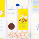
Hernesaaren Ranta by Werklig
Hernesaaren Ranta is an outdoor seaside area, located to the south of the Finnish capital of Helsinki, open during the summer months. It has food vendors, boat docks and terraces, and is part of an ongoing development project that also includes residential buildings. Graphic design studio Werklig were commissioned to create a comprehensive brand identity system for the entire area that, alongside...
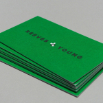
Reeves & Young by Matchstic
Reeves & Young is an Atlanta based construction and sub-contracting business that was formed in 2015 following the merger of Reeves Contracting Company and Potts Construction. To coincide with this merger, Reeves & Young worked with American graphic design studio Matchstic to develop a new brand identity that would convey the combined strength of the two businesses but would also be sensitive to...
The Practical Man by Garbett
The Practical Man is an online retail destination for men’s sports style and fitness, activewear and equipment, but also editorial content that covers reviews, fitness-focused travel guides and in-depth insight into new brands. It curates a catalogue of world-leading products that exist at the intersection of fashion and sports performance, designed by innovative and passionate brands with progressive approaches. Australian graphic design studio Garbett worked with The Practical Man...

Pia Ulin Photography by The Studio
Pia Ulin is a Swedish photographer, working between New York and Stockholm, who has built a considerable reputation from her daylight-only approach. This is said to infuse her images, which cover interior, lifestyle and still life, with a warm and natural quality. As well as producing editorial photography for publications such as Dwell, Martha Stewart and Elle Decoration, Pia has also contributed...
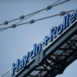
Haydn & Rollett by Richards Partners
Haydn & Rollett is an Auckland based construction company that has been in business since 1946. To coincide with its 70th birthday and in acknowledgement of the broadening of its services beyond just construction, the company worked with graphic design studio Richards Partners to develop a new brand identity that would better communicate who they are today whilst not abandoning their past. This...
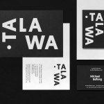
Talawa by Spy
Talawa, Jamaican patois for “small but feisty”, is an all black theatre company that looked to address the lack of opportunities for minorities and their marginalisation at the time of its founding in 1986. Since then it has established itself as one of the most successful theatres of its type in the United Kingdom. “Our work is informed by the wealth...
Life or Death by DIA
Life or Death is a New York and LA based full-service public relations and management business with hip hop roots. It draws its name from the idea that, within the music industry, there is no middle ground, it is either life or death. This abstraction and dual notion manifests itself within the firm’s new brand identity system, designed by DIA, as...
Melba at The Savoy by Pentagram
Melba is a pâtisserie and cafe, located on the corner of The Strand and Savoy Place in London’s North Bank, and is one of nine places to eat and drink at The Savoy hotel. The patisserie is described as offering a glimpse into the exclusive and luxury world of The Savoy, and is the first time that the hotel, accessed via private...
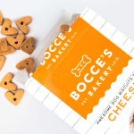
Bocce’s Bakery by Robot Food
Bocce’s Bakery creates nutritious handcrafted dog treats from natural, nutritious, locally sourced and seasonal ingredients from its premises in the New York borough of Brooklyn. Each of the bakery’s treats are batch-produced from four or less ingredients, brought together using simple wheat-free recipes, and born of a passion for conscientious organic cookery and inspired by Bocce, a biscuit loving dog who was carrying a few extra pounds. Bocce’s reached out...