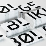
Mendeli Street Hotel by Koniak
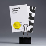
Mendeli Street is a city-beach hotel, designed by BK Architects, that celebrates the modern spirit of Tel-Aviv. Design studio Koniak developed a brand identity for the hotel, which included a logotype, stationery set, key cards, door-hangers and website, that reflect its contemporary qualities and the bright sunny climate of its location....
Molly Watson by Studio Blackburn
Molly Watson aids business leaders in the development and deployment of communication strategies that ‘accelerate and enrich the delivery of their goals’. Molly recently commissioned London-based design agency Studio Blackburn to help articulate this business proposition and to stand out through the creation of a new brand identity that included a logotype, yet-to-launch website, stationery, business cards, templates and CV...
KMP by Studio8585
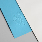
Dr. Ksenija Magašić Pinezić provides affordable dental services locally and to international dental tourists in a warm and friendly practice located in the Croatian coastal city of Rijeka. Design agency Studio8585 worked with Ksenija to develop a new brand identity design—which went on to include a logo, stationery, business cards, tote bag and responsive website—that would make the most of a lengthy name....
Mark Milton by ico Design
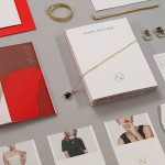
London-based design studio ico Design have recently completed their brand identity work for Mark Milton, a jeweller with a family heritage within the industry that dates back to 1947, and who carefully selects and retails a range of necklaces, earrings, bracelets and rings for women. Bound by the theme of curation, ico Design’s solution provides the Mark Milton brand with a high quality communicative breadth...
Papillon Blu by Sciencewerk
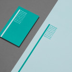
Papillon Blu is a privately owned spa and wellness centre located at the heart of Indonesia’s Surabaya City. Independent design studio Sciencewerk recently worked with the spa to develop a new brand identity, which included a logomark, logotype, print, environmental signage and website, based around the name blue butterfly....
Bølgeblikk Arkitekter by Tank
In response to a change in leadership and the acquisition of new staff, Norwegian architectural firm Ottar commissioned Tromsø and Oslo-based design studio Tank to develop a new name and brand identity—which would go on to include a logo, stationery set and responsive website—that would better reflect the quality, professionalism and scale of the firm’s work within the health and education sector, whilst...
Anthem by Anagrama
Anthem will be a scouting and transfer business within the professional football market working predominantly across Spain, Switzerland and Mexico. Anthem will also be responsible for organising and promoting a variety of sporting events. Design agency Anagrama were recently commissioned to develop a new brand identity for the company—which included a logo, logotype and stationery set—that would communicate the prestige,...

The Swedish History Museum by Bold
The Swedish History Museum is one of the country’s largest museums with a collection of over 10 million objects from a history that spans thousands of years. The museum also functions as a venue for lectures, concerts and a variety of activities. Stockholm-based design studio Bold were recently commissioned to develop a new brand identity for the museum that would...
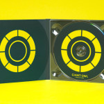
Giant Owl Productions by Alphabetical
Giant Owl is a London-based independent production company that creates television programmes, commercials and short films for clients such as Channel 4 and Rimmel London. Design agency Alphabetical recently developed a new brand identity solution for Giant Owl—which included an animated logo, flat colour palette, glow-in-the-dark paper and bold illustrative detail—that leverages a simple observation to balance an expected technicality with a playful...
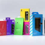
uBear by Hype Type Studio & Mash Creative
uBear is a high-end mobile phone, tablet and laptop accessories business located in Los Angeles, California. Their visual identity, developed by Hype Type Studio and Mash Creative, included a new logo, stationery set, packaging and responsive website. By utilising the bold graphic detail of diagonal stripes, sans-serif type, a bright and diverse colour palette, fine diagrammatic illustration, foils and varnishes and a simple bear...
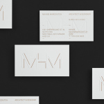
MHM Architects by 26 Lettres
MHM Architect is the studio of independent Canadian architect Maxine H. Marcovitch who, working with a team of professionals, trade and closely with clients, creates “beautiful, innovative, and unconventional architectural spaces.” The studio’s new brand identity, developed by 26 Lettres and which included a logotype, blind embossed business cards, portfolio with open stitch detail and website, delivers a familiar but appropriate...
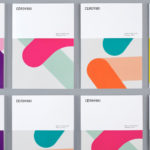
Cerovski by Bunch
Cerovski is a young Croatian print production studio that revels in the challenge of “nebulous finishing, microscopic editions, absurd materials and crazy deadlines”. Bunch worked with Cerovski to develop a new brand identity for the studio—which included a custom logotype and typeface, website, and a variety of printed collateral—that delivers a distinctive contrast of utility and creative flourish, technology and individualised service...