The Best of BP&O — February 2016
Opinion by Richard Baird Posted 29 February 2016
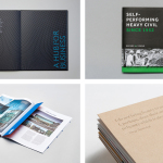
February’s highlights included Karoshi’s custom type, stationery, tags, photography and website for homeware business Thanda, Werklig’s brand identity for Helsinki’s seaside destination Hernesaaren Ranta and ico’s work for London restaurant Shauang Shuang. However, there were five projects that stood out, and have made it into BP&O’s Best Of Series.
This feature brings together the most interesting, unexpected or unusual projects published on the site each month for another opportunity to be seen and shared. These typically balance a strong concept with a compelling aesthetic that appropriately plays with material colour and texture, form, type, layout and print finish.

Aman by Construct, United Kingdom
Aman is a collection of resorts, hotels and luxury residencies that offer access to a wide variety of remote and urban destinations. Its first resort, Amanpuri, was opened in Thailand in 1988. Since then it has expanded across the world, seeking out transformative experiences and awe-inspiring locations throughout Asia, Indonesia, China, Japan, the Americas, North Africa, Europe and the Mediterranean.
Inspired by the earliest forms of alphabets and mark-making, London based graphic design studio Construct developed a new brand identity for Aman that would reflect its values and the high quality of its experiences. This is expressed through custom typography, earthy colour palette, tactile material texture and high quality print finish that links press-pack, business cards and menus.
See more of this project here


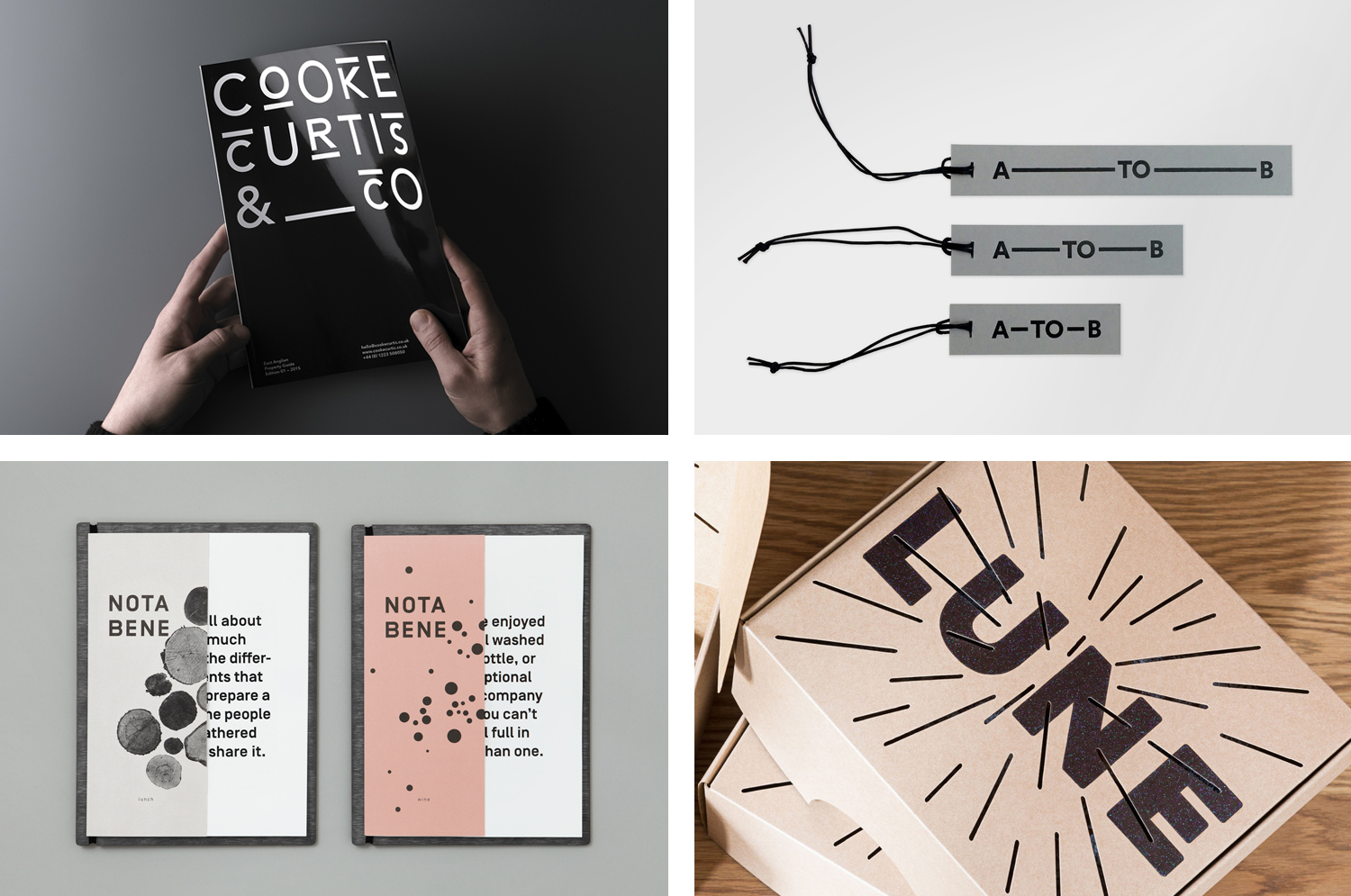
Cooke Curtis & Co. by The District, United Kingdom
Cooke Curtis & Co. is an award-winning estate agent with an office in Cambridge, United Kingdom. It has a portfolio and a thorough understanding of properties throughout the city and in neighbouring villages. Although the business was established last year, its founders have over thirty-five years of industry experience.
Local graphic design studio The District were commissioned by the estate agent to develop a visual identity that would work across a broad range of printed and digital media, from business cards, letterheads, brochures and website to ‘for sale’ signs, vehicle graphics and key rings.
With the intention of delivering a distinctive and impactful solution sensitive to the heritage of the founders, and the will to cut through the hyperbole of the industry, The District took a bold typographic approach that discards photography in favour of a monolinear geometric sans-serif and underlines, emphasised by a black and white colour palette.
See more of this project here

A–TO–B by Stockholm Design Lab, Sweden
A-TO-B is a retail destination dedicated to all things travel. It curates and sells smart practical products for the modern traveller, complimented by insight and advice. Whether it be an around the world trip or the daily commute, a preference for small private labels or well-known bag brands, A-TO-B has it covered.
Venue Retail Group—owners of A-TO-B and over 150 shoe, bag and accessory stores throughout Denmark, Finland, Iceland, Norway and Sweden—approached Stockholm Design Lab to work on naming, strategy and brand identity, and to develop a new and refreshing retail experience.
Although this project rolled out towards the end of last year, Stockholm Design Lab were kindly in touch at the beginning of February with new images. These document the extent of the project, include shots of product cards, packaging and posters, and take a better look at the adaptable system that connects these.
See more of this project here

Lune Croissante by A friend Of Mine, Australia
Lune Croissanterie is a Melbourne based bakery dedicated to the craft of Viennoiserie. After gaining a cult following and amassing long cues it quickly outgrew its small shop and moved into a larger warehouse space in the suburb of Fitzroy which features a distinctive interior design by Studio Esteta. To coincide with this move, Lune Croissanterie worked with the Australian graphic design studio A Friend Of Mine to develop a new brand identity. This takes the name, space theme and rocket of the previous identity and refines and expands on it with a few extra playful details. These effectively link packaging, signage, interior and website.
Read more of this article here
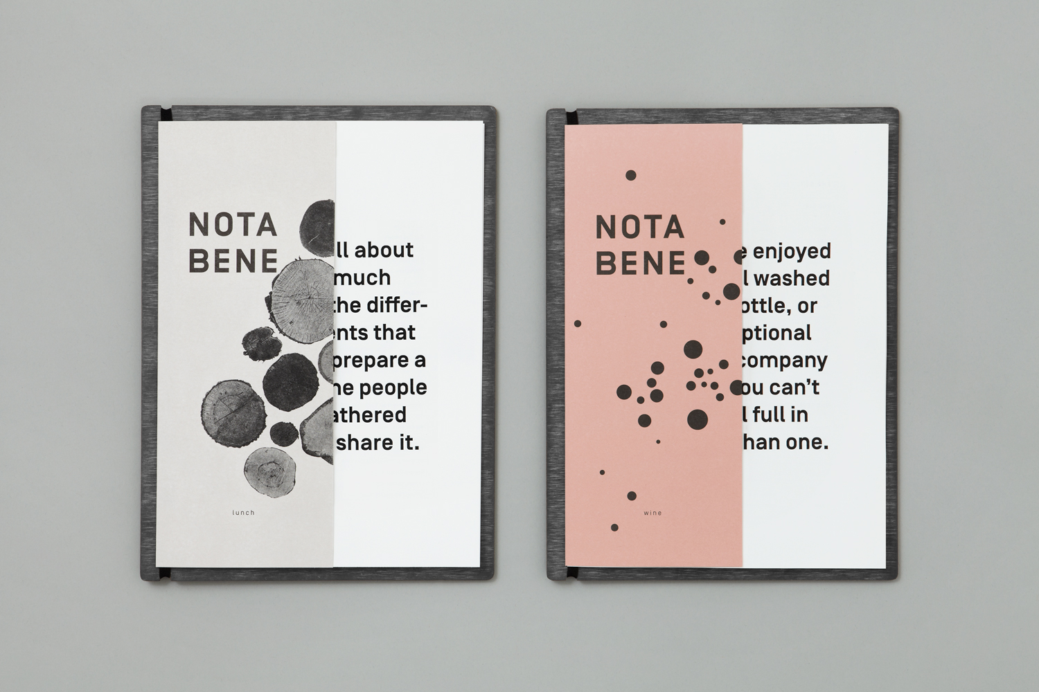
Nota Bene by Blok, Canada
Nota Bene is a restaurant, located on Toronto’s Queen Street West, with a menu made from locally-sourced and seasonal ingredients. It was opened by chef David Lee and business partners Yannick Bigourdan and Franco Prevedello in 2008, and was awarded “Best New Restaurant” by Toronto Life and enRoute Magazine soon after.
To coincide with the restaurant’s 2016 relaunch—which saw David Lee take sole ownership and the unveiling of a new menu and interior—Nota Bene worked with Canadian graphic design studio Blok to develop a new visual identity. This was inspired by David Lee’s approach to food and the restaurant’s new environment; a marriage of organic detail and contemporary materiality created by +tongtong, and runs across menus, stationery, business cards, postcards, packaging and website.
Read more of this article here