BP&O Collections — Material Thinking
Opinion by Richard Baird Posted 27 June 2017
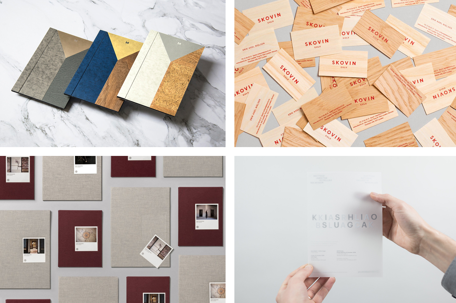
A collection of brand identity and packaging design projects published on BP&O that feature a distinctive material component, be that in external shape or internal structure, choice of substrate or print finish. This post includes work by Bibliothèque, Bedow and Mucho, and covers a variety of print finishes, material choices and production techniques.
Although many of the featured projects could be described as being stylistically compelling, their materiality is firmly rooted in concept, rather than the final beautification of type and image. For example, Mucho draw on locality for their work with Sant Francesc, Bibliothèque channel European and South Pacific heritage across the menus for restaurant Mere, and Filthymedia play with the industrial associations of Boxpark.
This post looks to showcase a variety of approaches, and intentionally moves between the abstract and the literal, the visceral and intellectual, and from the simple to the rich. Be sure to click the images to read more about the ideas that underpin the material expression of each project. This post will be continually updated, so bookmark and check back later, or take a look at more BP&O Collections here.
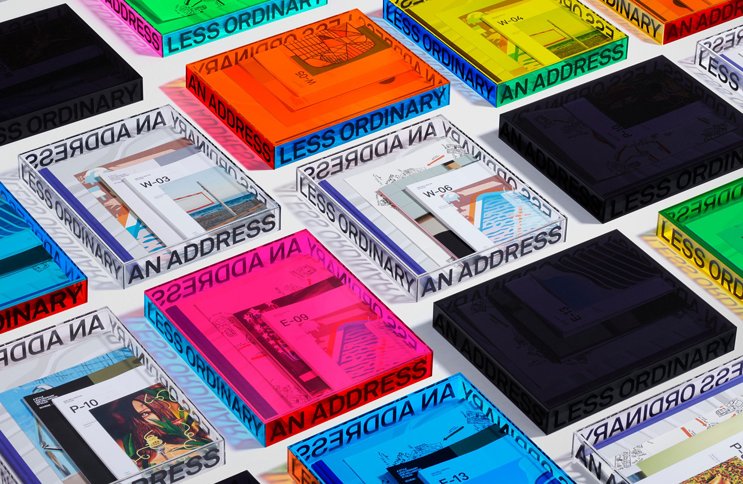
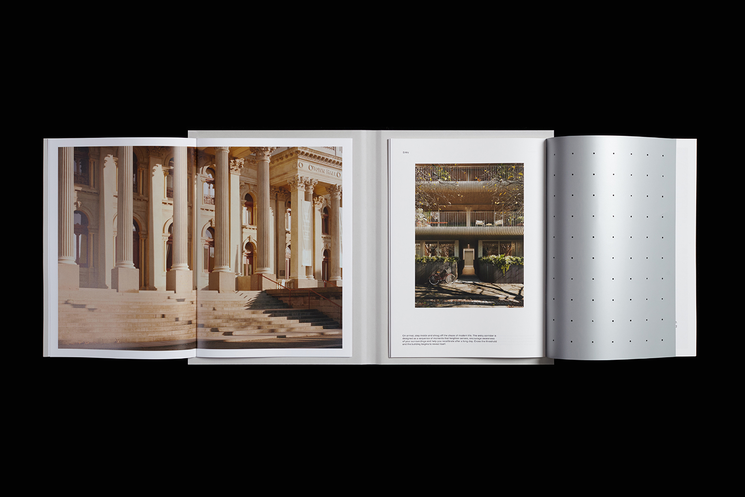
One Wellington St Kilda by Studio Ongarato, Australia
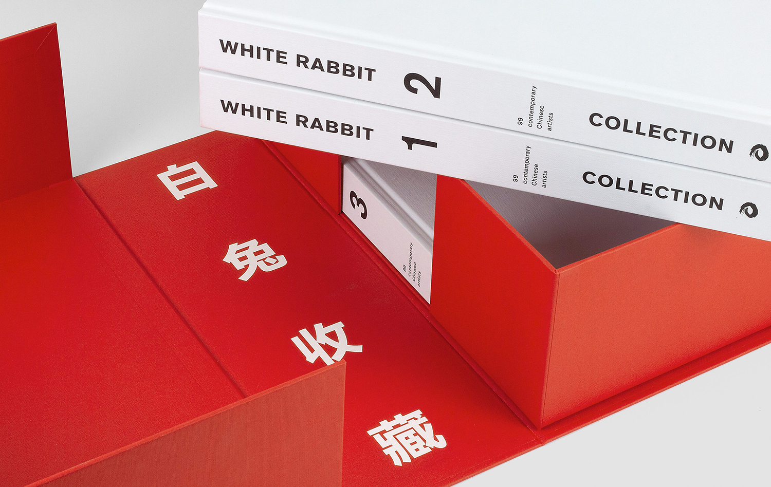
White Rabbit Collection by Toko, Australia
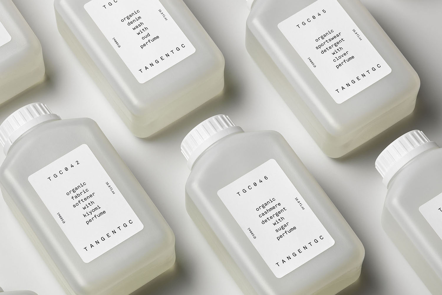
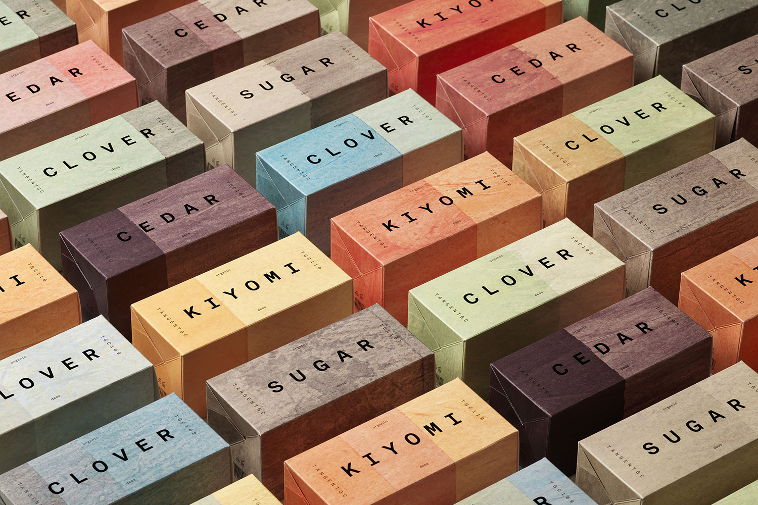
Tangent GC Organic Detergents by Carl Nas Associates, United Kingdom
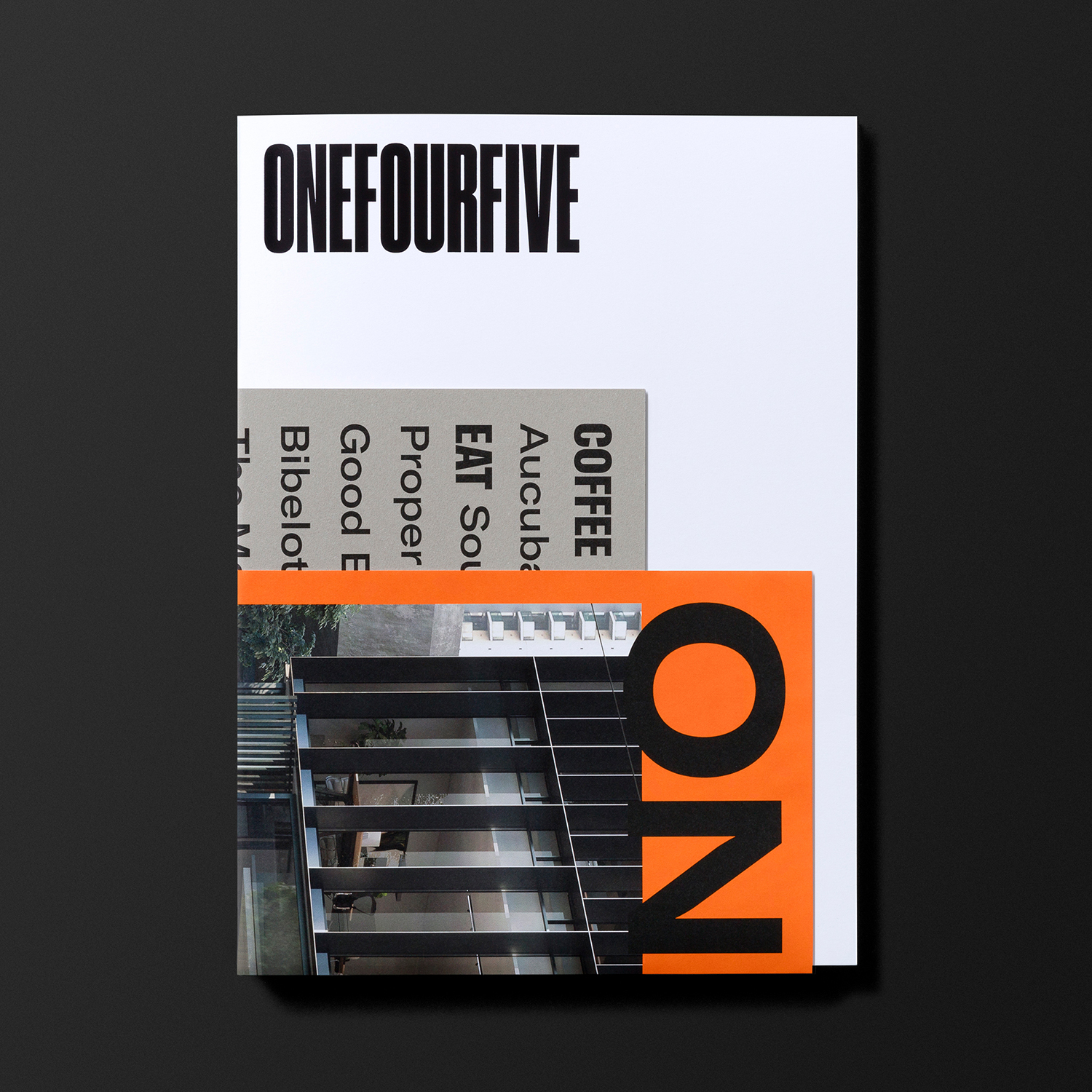
OneFourFive Clarendon by Studio Brave, Australia
Napier Street by Studio Hi Ho, Australia
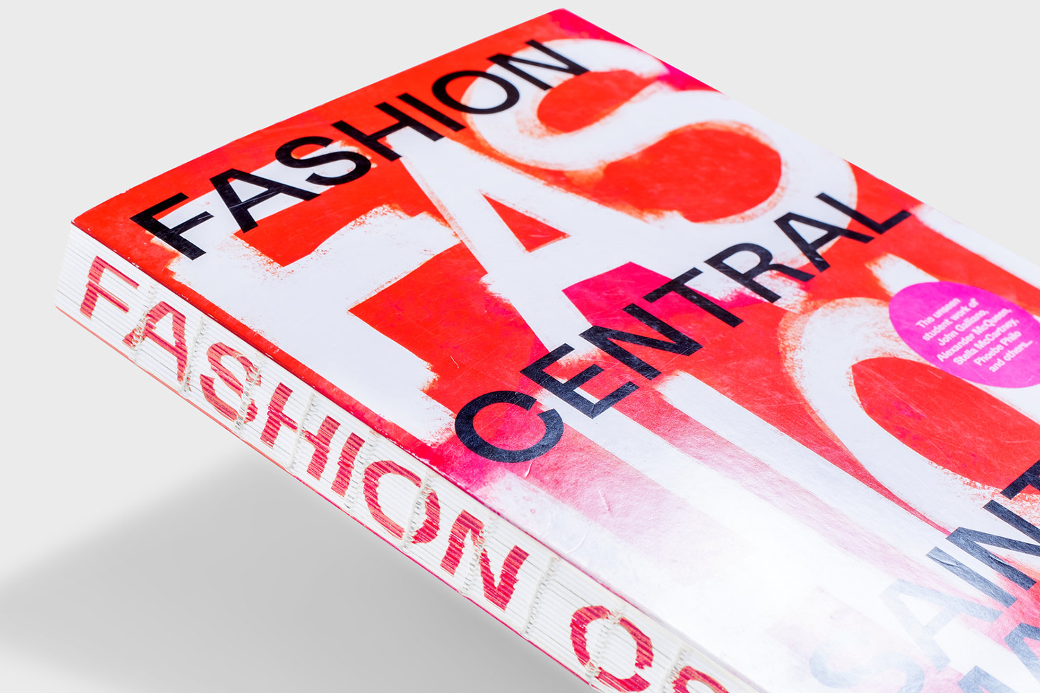
Fashion Central Saint Martins by Praline, United Kingdom
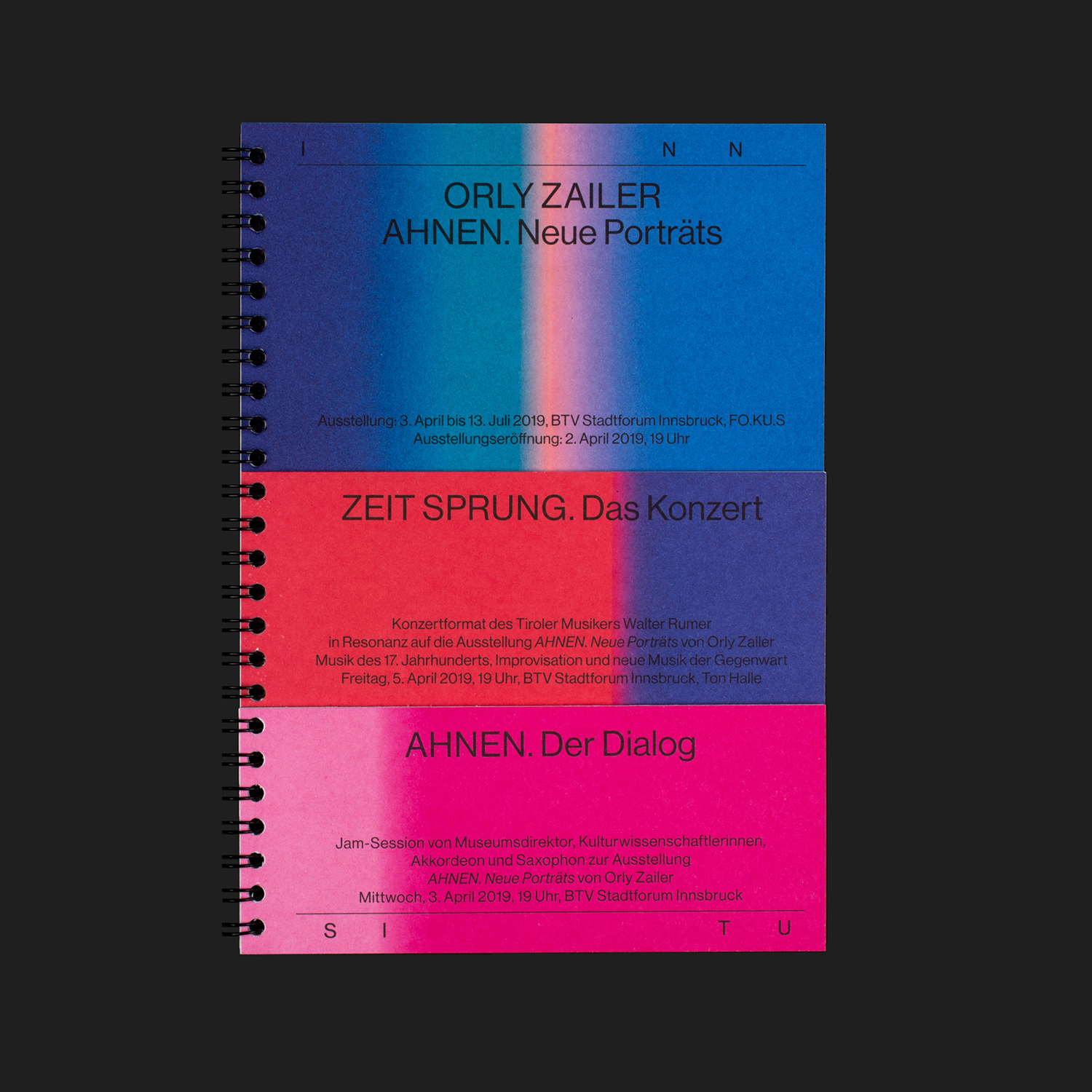
Inn Situ by Studio Mut, Italy
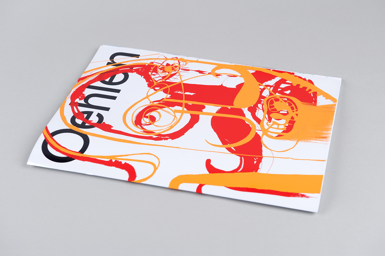
Albert Oehlen Book by Zak Group, United Kingdom
TGC x Stenerhag by Carl Nas Associates, United Kingdom
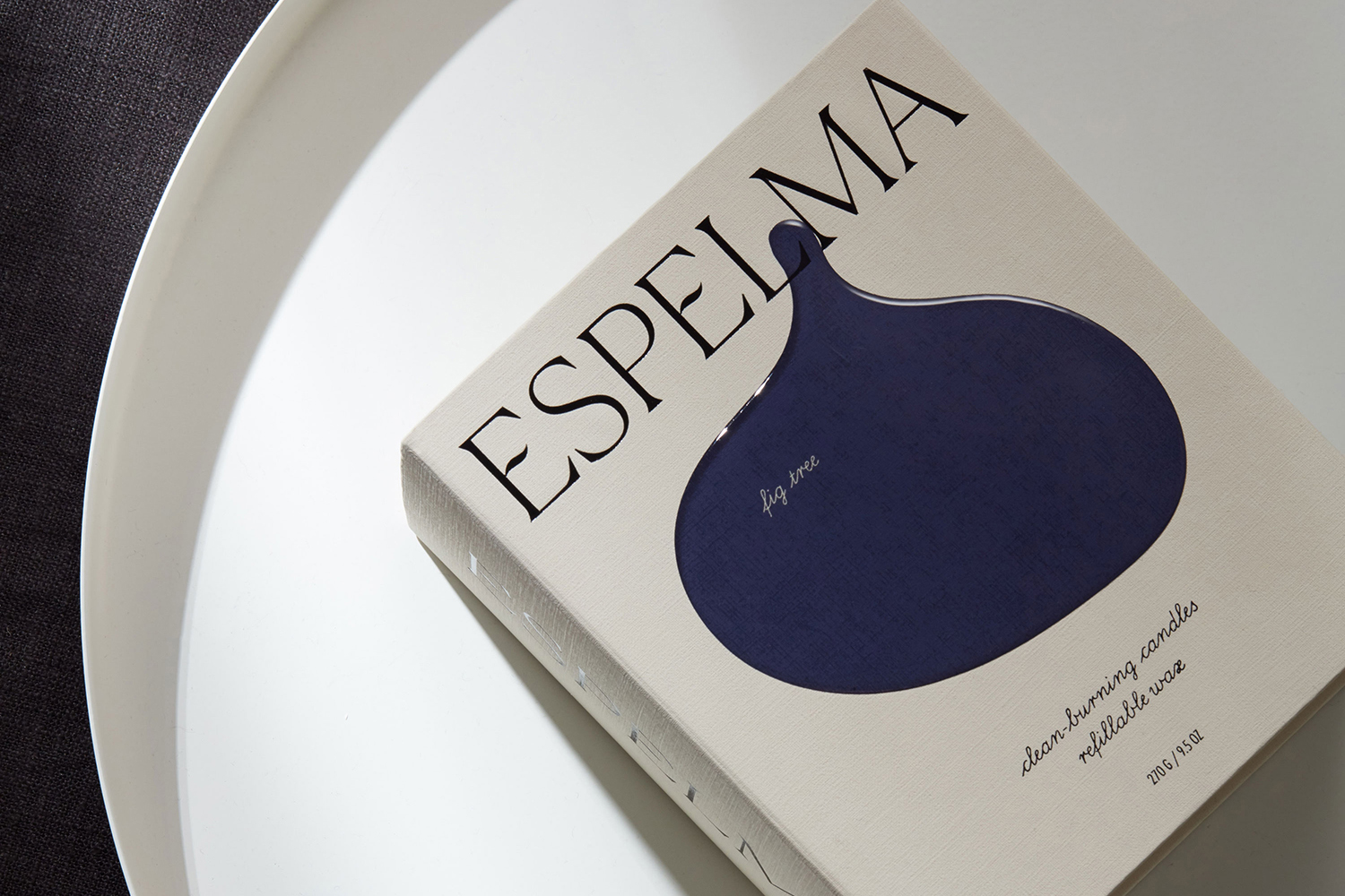
Espelma by Commission, United Kingdom
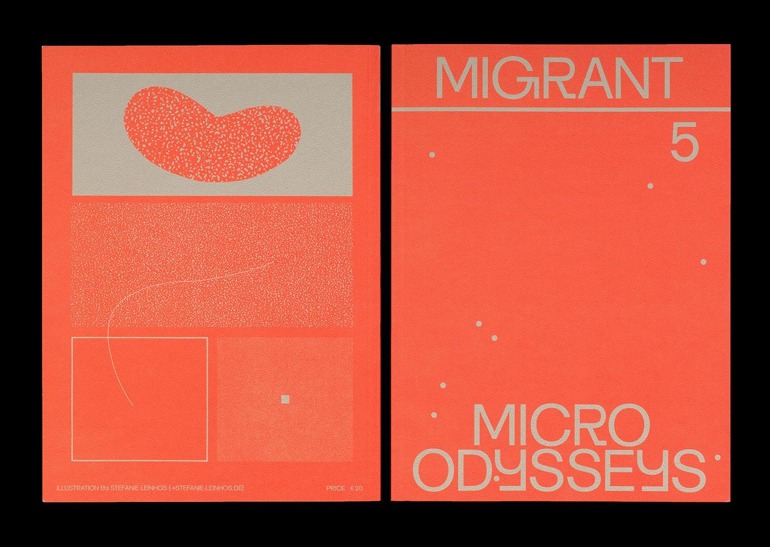
Migrant Journal No.5 by Offshore Studio, Switzerland
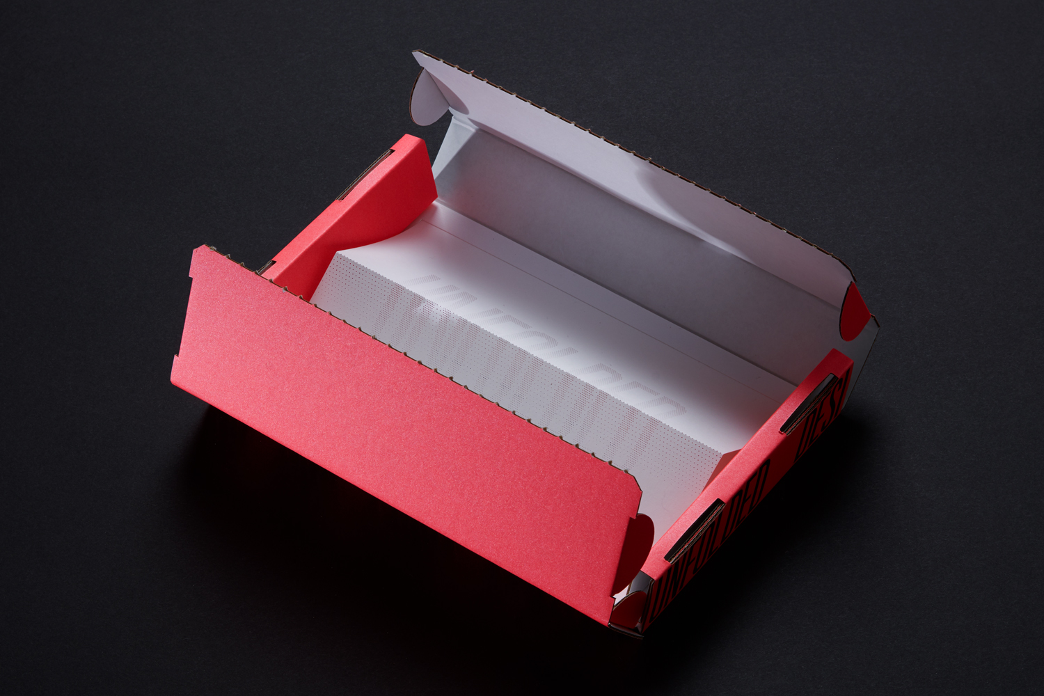
Unfolded by Commission, United Kingdom
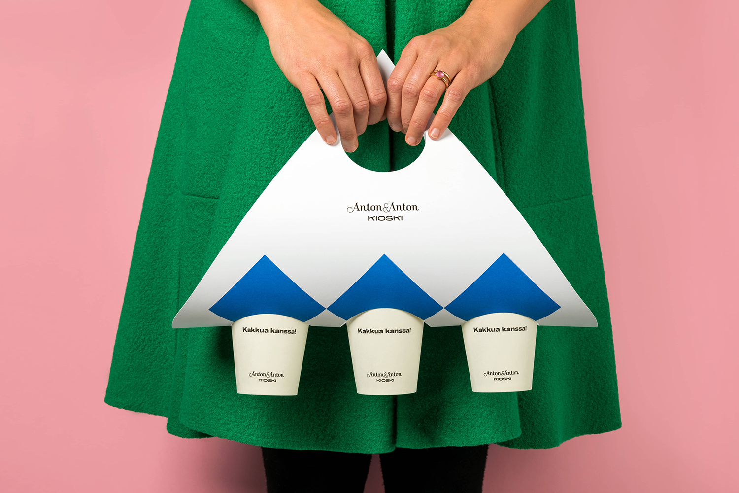
Anton&Anton Kioski by Bond, Finland
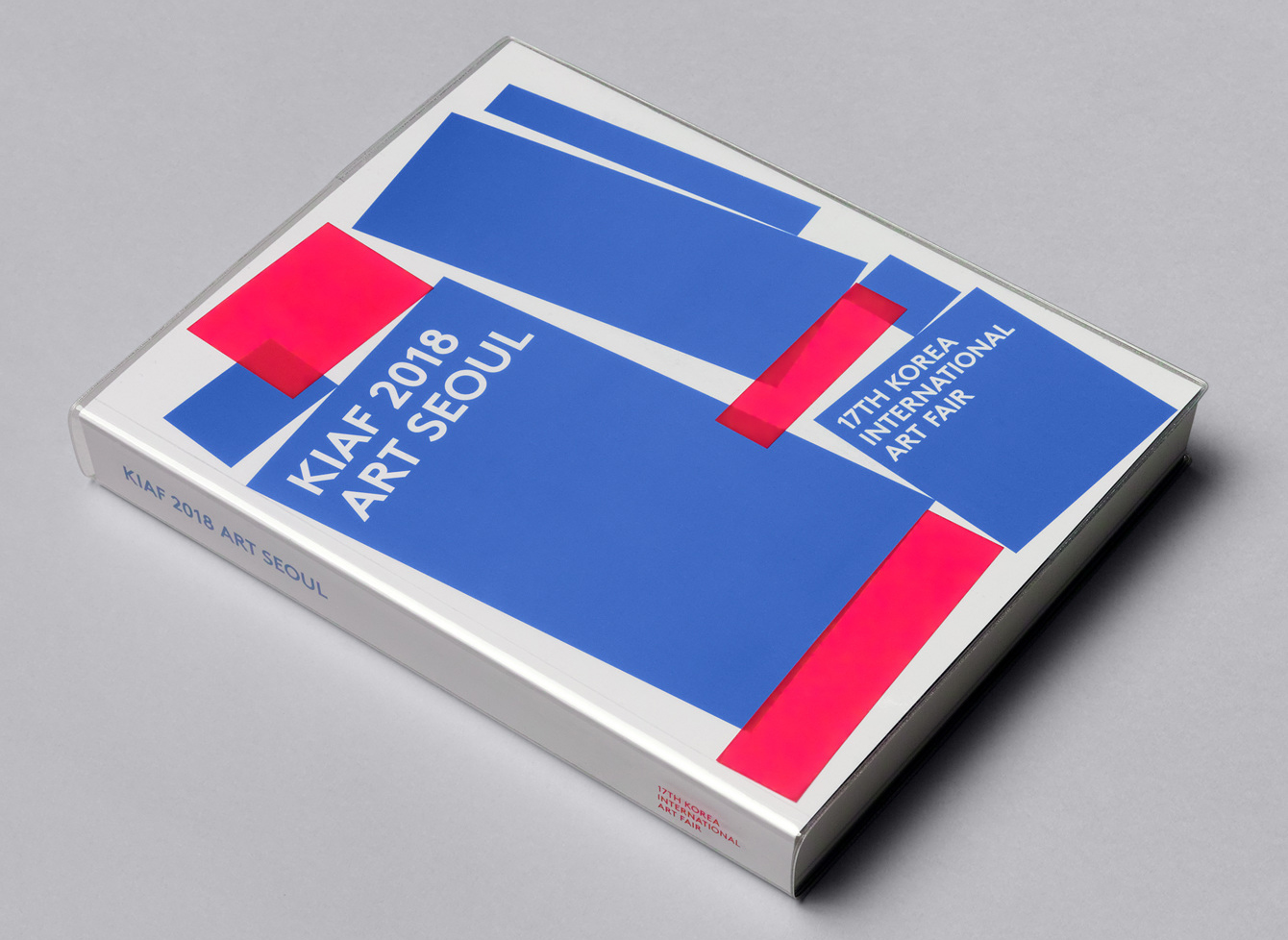
Korea International Art Fair 2018 by Studio fnt, South Korea
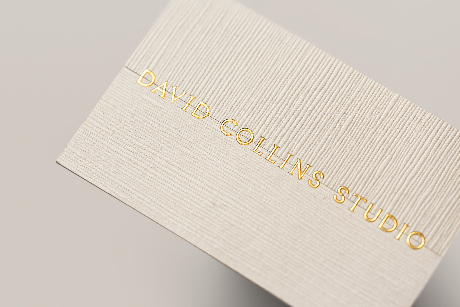
David Collins Studio by Bibliothèque Design, United Kingdom
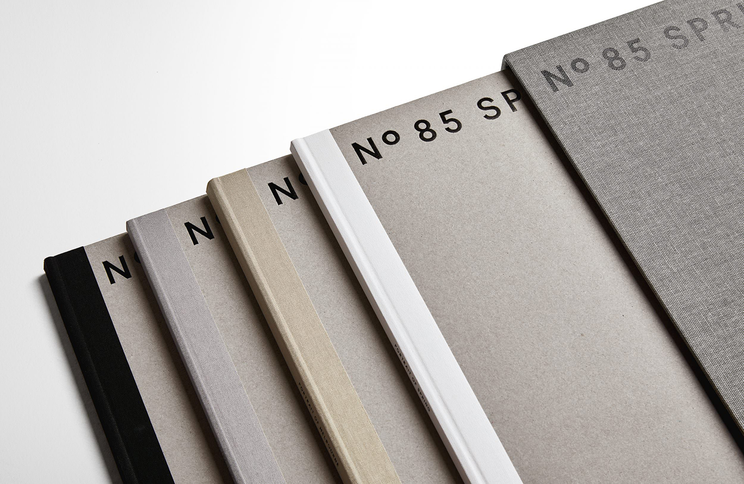
85 Spring Street by Studio Ongarato, Australia
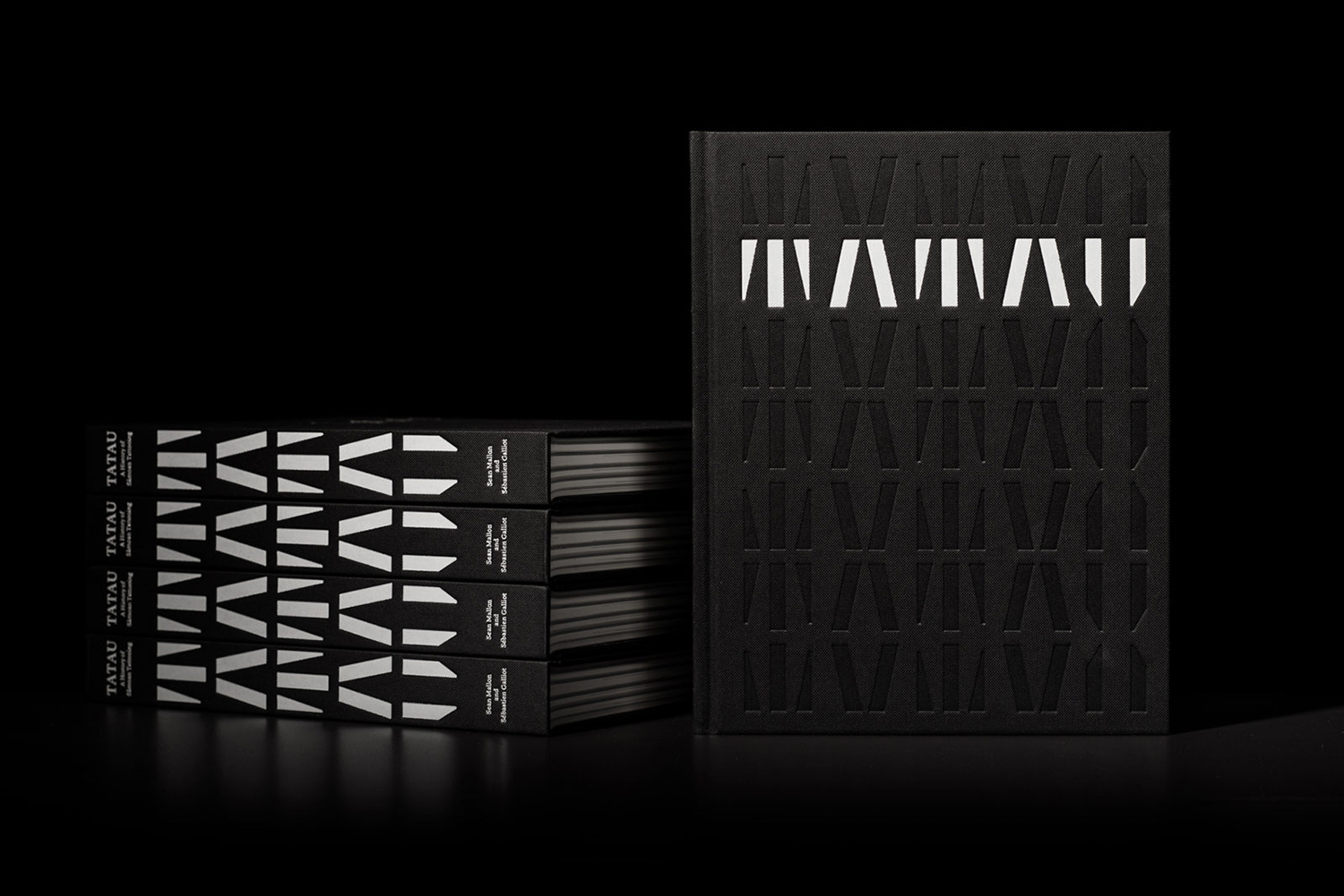
Tatau by Inhouse, New Zealand
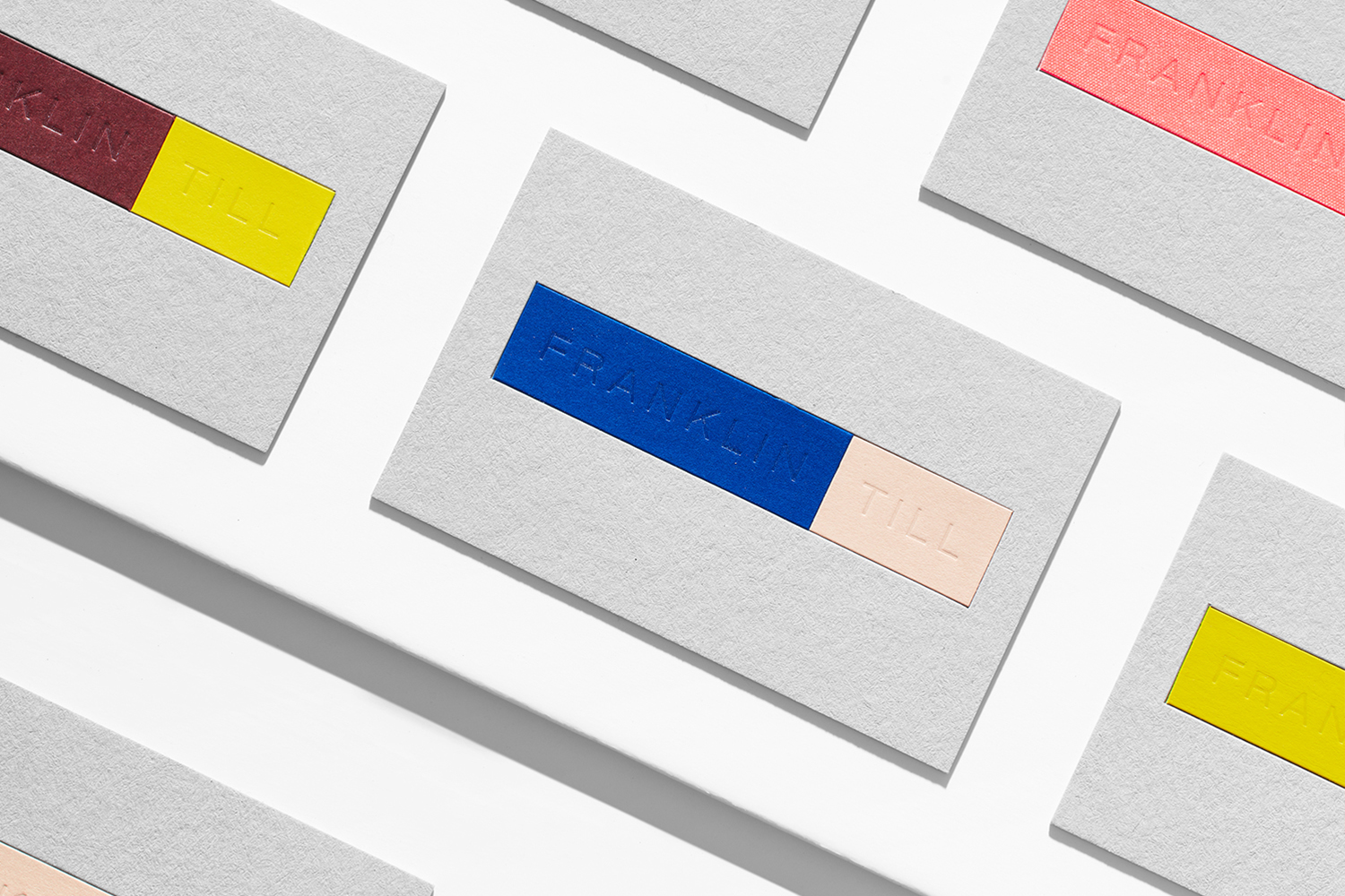
FranklinTill by Commission, United Kingdom
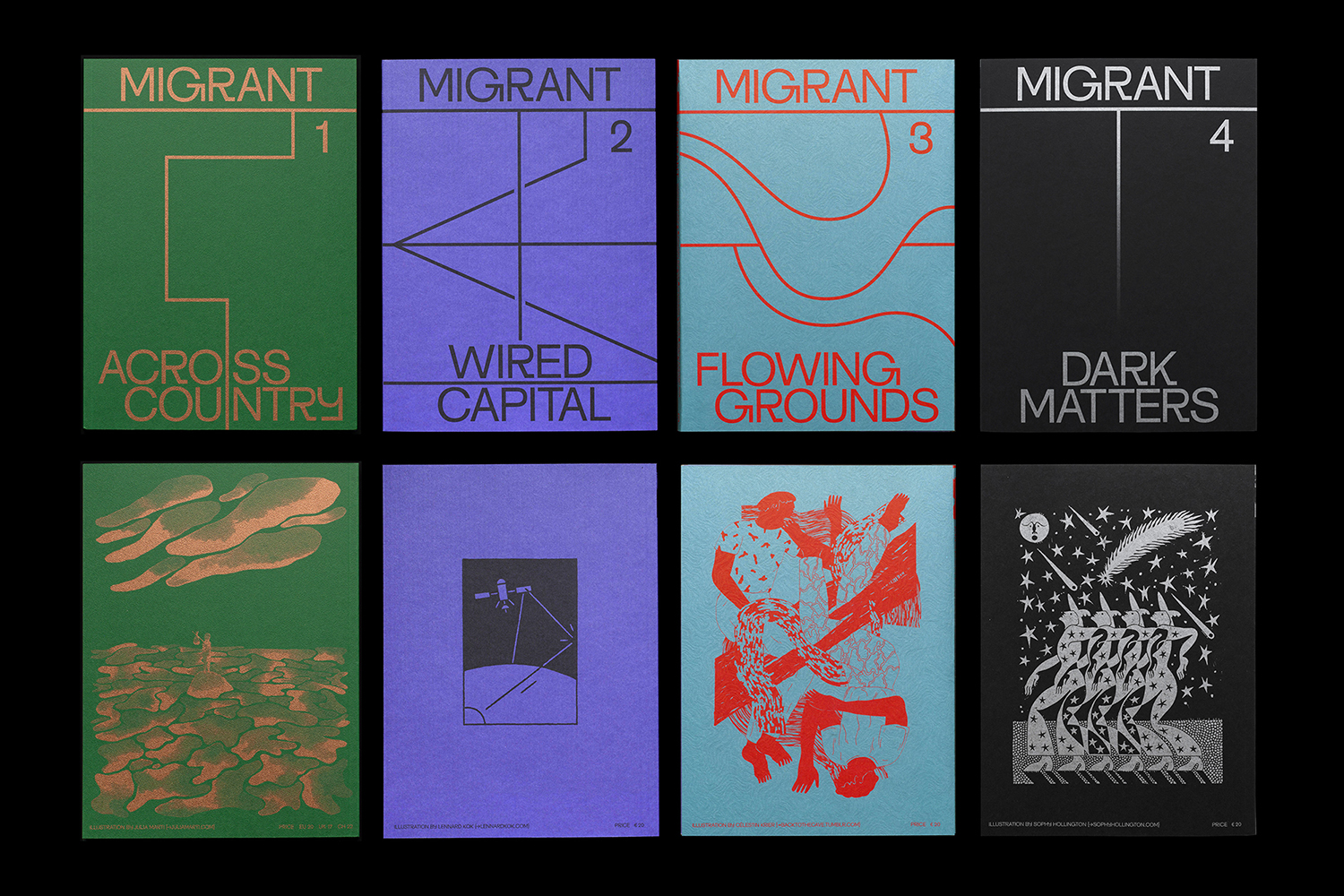
Migrant Journal by Offshore Studio, Switzerland
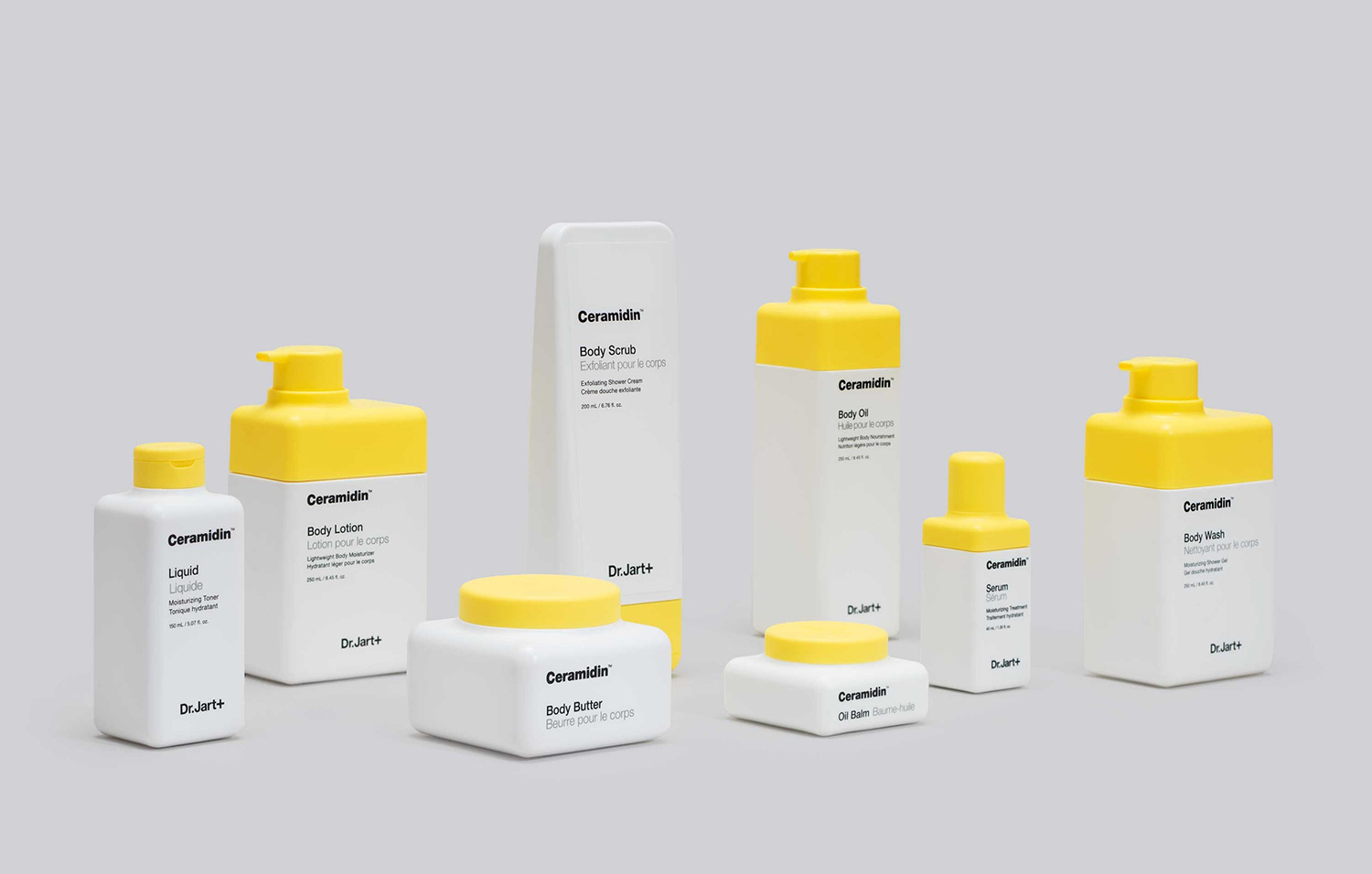
Dr Jart+ by Pentagram, United States
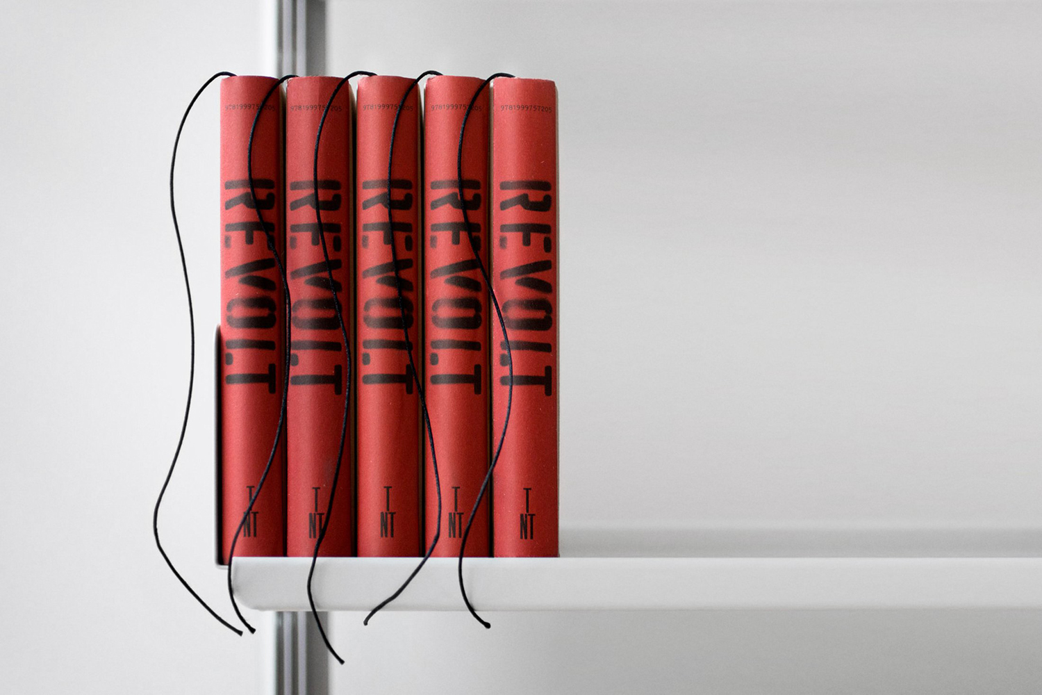
Revolt by Paul Belford Ltd., United Kingdom
REVOLT is an instruction manual for businesses seeking to do more with their brand. Its central premise is built around having people on your side; that the ability to form and activate a group is the secret to success. It essentially leverages and intends to help channel any feeling of disenfranchisement and anger into affirmative action and movements of change. Content feels very much of its time, although the visual and form language of action and disruption, revolution and dissent employed by Paul Belford Ltd. is an enduring and universal one. Conflating political and societal struggles with corporate interest is bold and provocative, as is its explosive visual and material expression.
Mere by Bibliothèque, United Kingdom
Bibliothèque touch upon on the European and South Pacific heritage of Mere’s founders, Monica and David Galetti, and the interior design of the restaurant in the intersection of materials. And go on to draw a parallel with culinary craft in the inlaying of materials, a process of extensive experimentation and careful production in collaboration with French workshop Imprimerie du Marais.
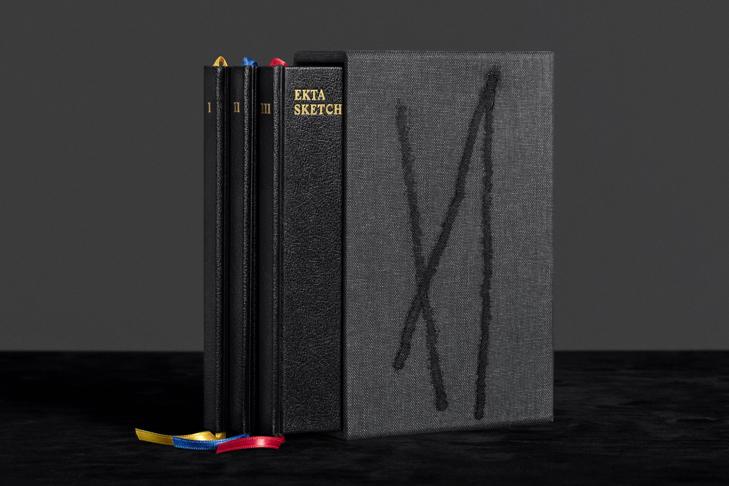
Ekta Sketchbooks Vol. I–III by Lundgren+Lindqvist, Sweden
Lundgren+Lindqvist play with the line between art book and journal for Swedish animator, sculptor, designer and illustrator Daniel Götesson. Ekta Sketchbooks function as a facsimile of the artist’s process, moving between moments of spontaneous expression and images that have a completed quality. Utilising the universal form and material qualities of a notepad, alongside essays and hand finished and numbered details, Lundgren+Lindqvist draw the reader closer to the artist.
Essem Design Product Catalogue 2018 by Bedow, Sweden
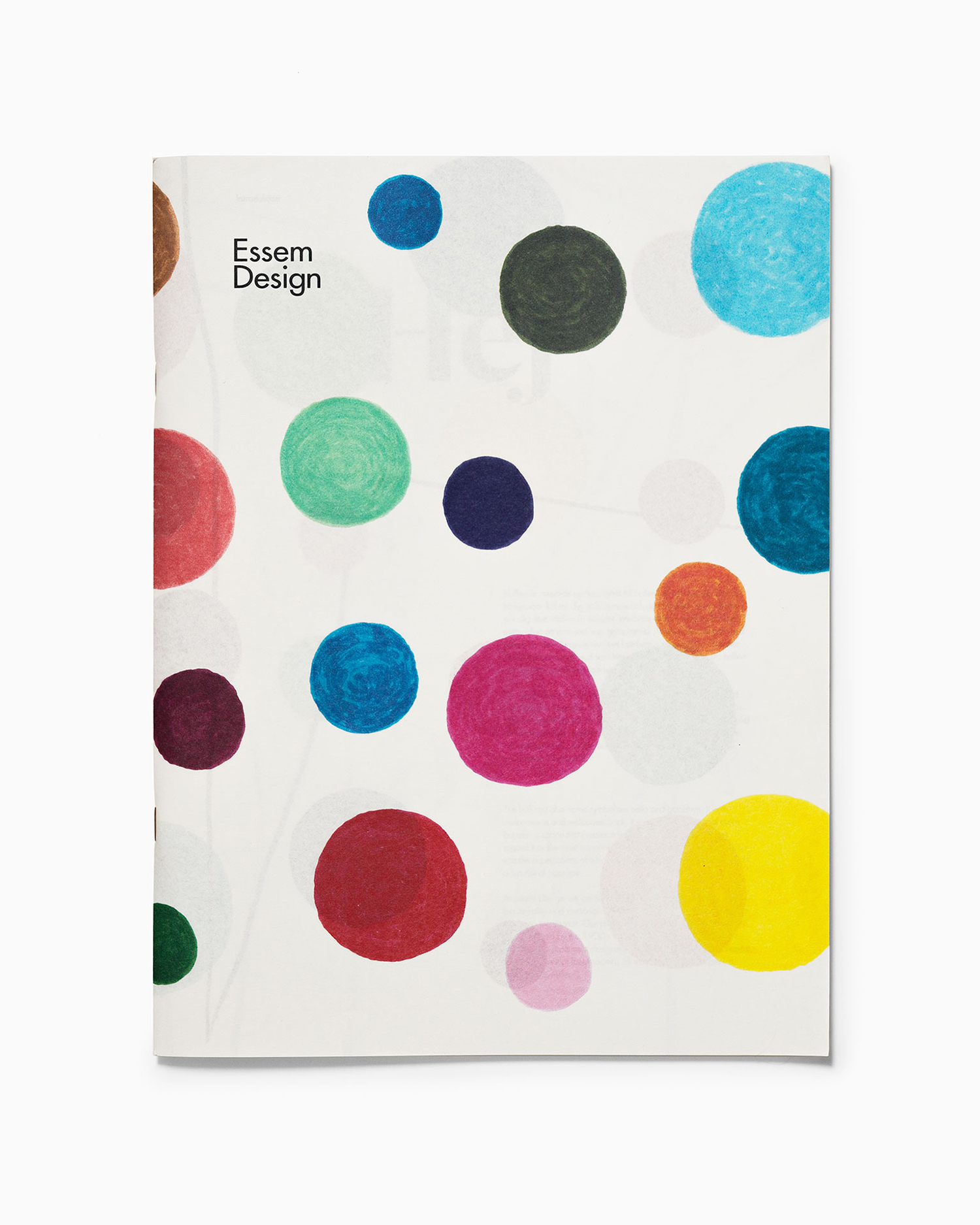
Employing a light sketchbook-like paper, pairing this with bringhtly colour pattern and illustration and alongside art direction that focuses on functionality Bedow make a compelling connection between the creative play a the product that follows.
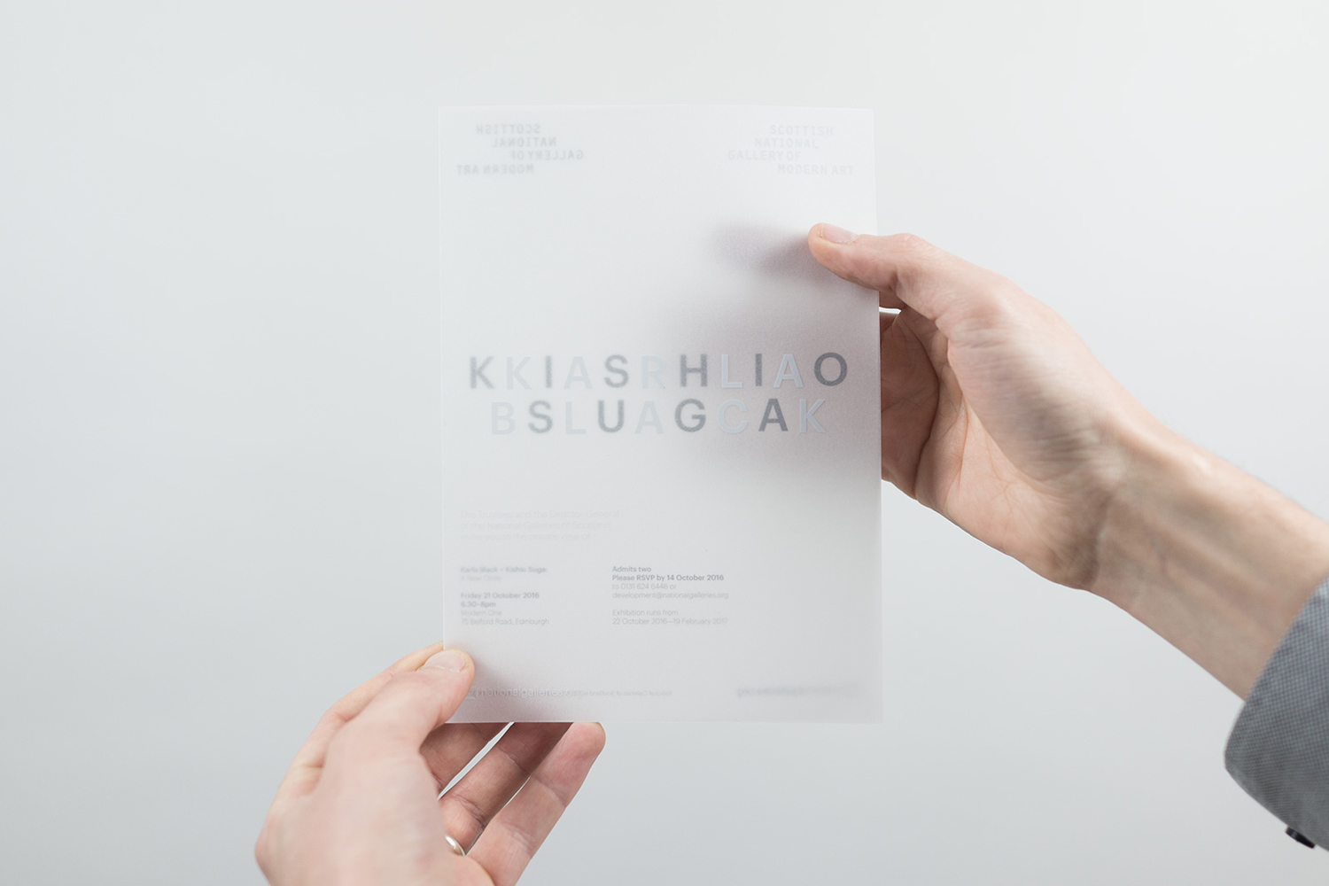
Karla Black + Kishio Suga: A New Order by O Street, UK
O Street look to express the thematic commonality yet geographical difference between the sculptors Karla Black and Kishio Suga as part of their shared exhibition A New Order at Modern One, Scotland.
This is explored graphically through the intersection of artist names and a shared typeface, yet divides these through colour and motion. An interesting material component is introduced in the use of a semi- transparent paper, and in the printing of one name front and the other on the back. This brings a diffused quality to Kishio Suga, and serves to connect and divide in an interesting manner.
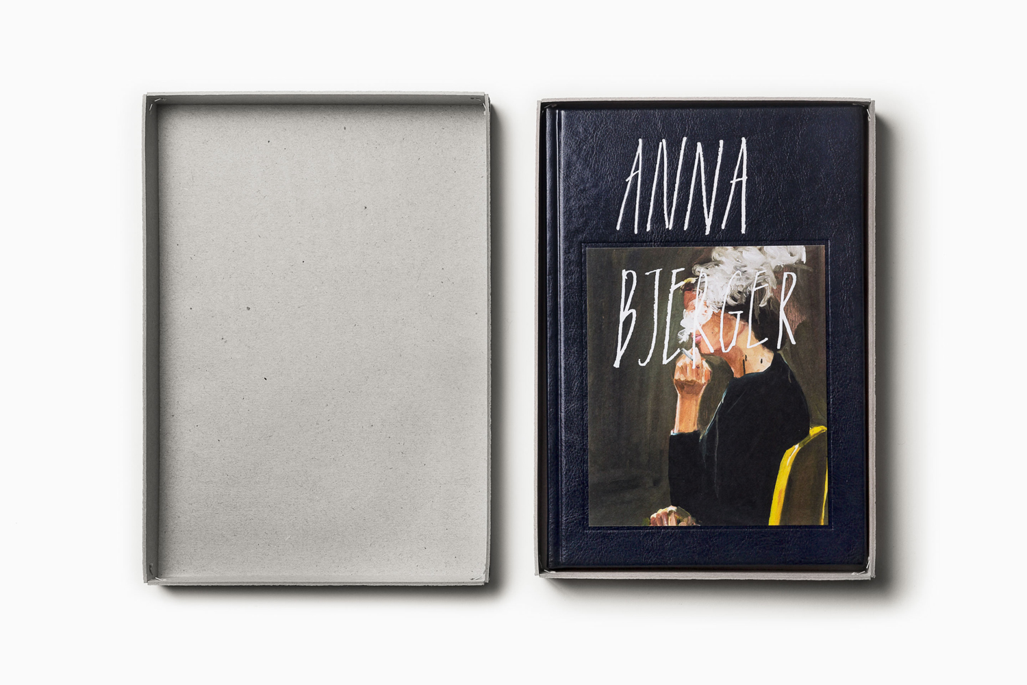
Anna Bjerger Book by Bedow, Sweden
Bedow make a personal connection to artist Anna Bjerger, and draw on the tactile vernacular of boxes of loose photos and the material flourish of classic photo albums through finger prints, robust unbleached box and leather bound and embossed book.
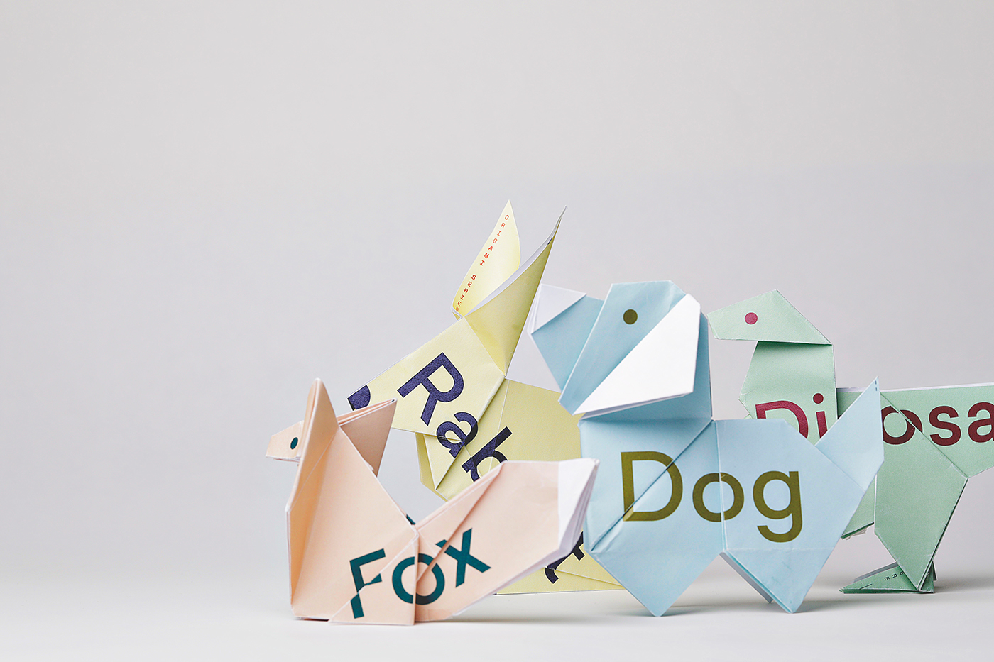
Sydlexia: Making Sense Of Dyslexia by BBDO Dubai, UAE
For Sydlexia, BBDO Dubai find an intelligent meeting point between compelling and modern single sheet graphic expression of fractured words and the material play of completing these words through the creation of origami animals.
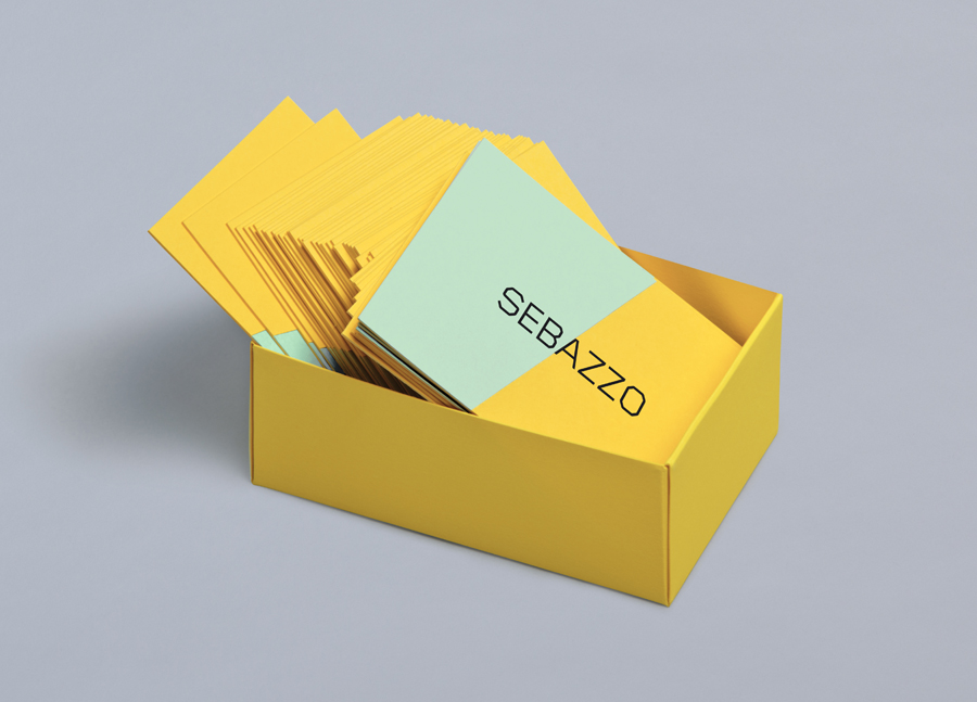
Sebazzo by Bunch, United Kingdom
Design duo and studio Sebazzo bring a crafted approach to digital services. This is expressed by Bunch in the process of paper marquetry, the bring together and inlaying of dyed boards. The dual colour of business cards, and the bisection of name is informed by the partnership at the heart of the studio.
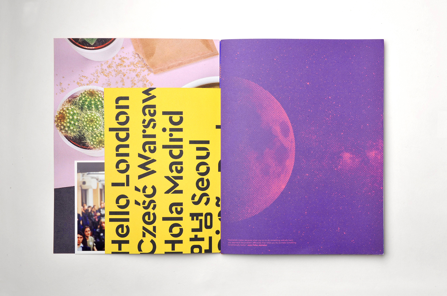
Campus by MultiAdaptor, United Kingdom
There are some neat techniques mixed in with MultiAdaptor’s brochure for Google’s Campus, a co-working and events space, as part of a broader brand identity programme. Highlights include the use of white bordered photography, the use of proportion and colour to break up pages, and the interplay between the very personal (image), the industrial (type) and creative play and design craft (colour, material, cuts, binds and finishes). It is busy but considered, with a pleasant and unexpected scrapbook quality that feels well-suited to a start-up hub of community, activity and creativity.
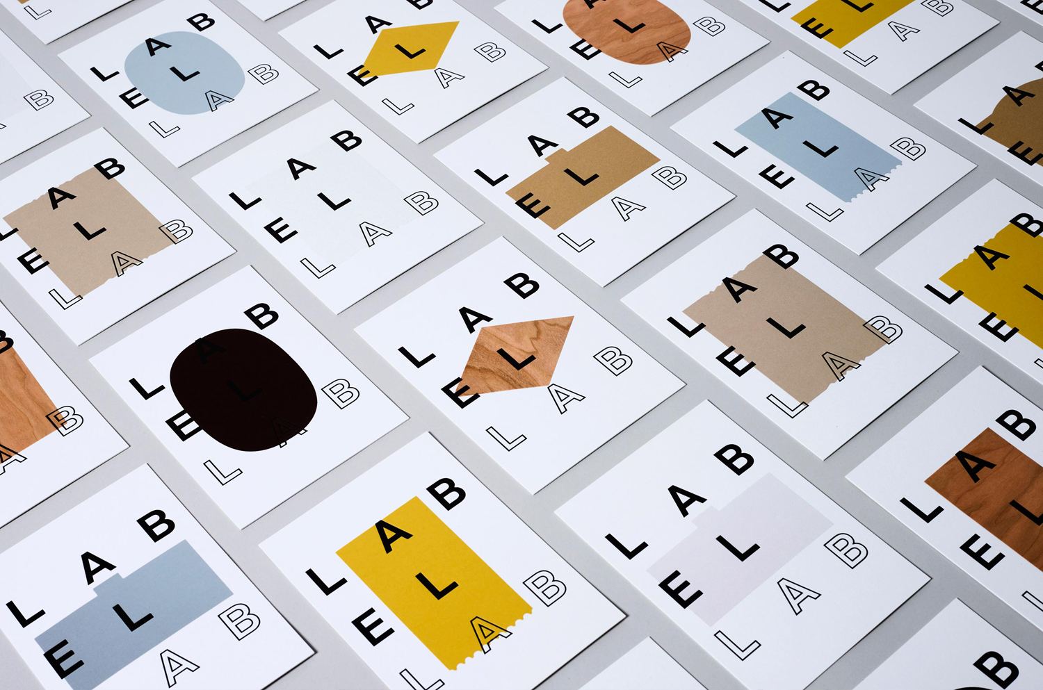
Label Lab by TM, United Kingdom
Label Label, through exhibition and talks, intended to showcase the potential of Arconvert’s new papers and boards in branding and packaging. Design studio TM, through form, colour and texture, utilising much of the adhesive paper range across invitations, explores the theme of creative potential.
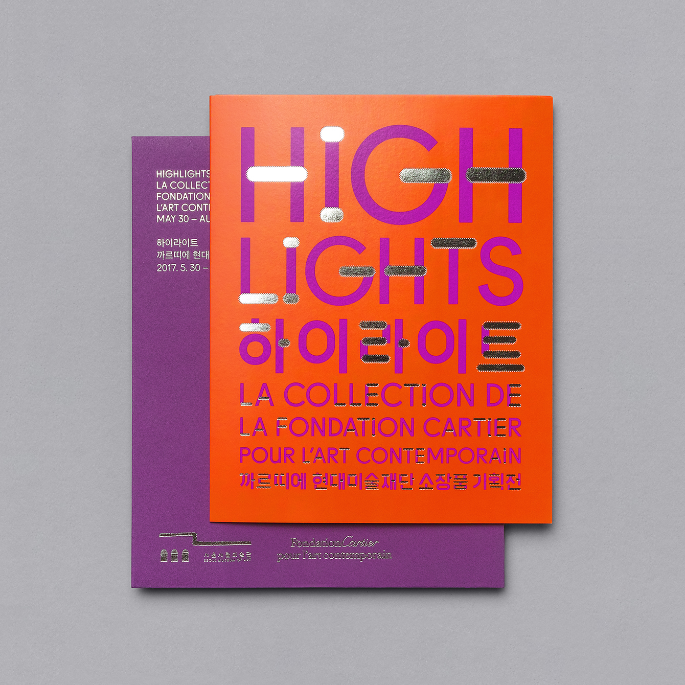
Highlights by Studio fnt, South Korea
Fondation Cartier’s building, designed by renowned French architect Jean Nouvel, is celebrated for its interplay between structure and nature, and the transition from outside and inside, achieved by a prominent steel frame and glass panels, which extend out past the building.
Studio fnt explore this in the visual identity work for Highlights, an exhibition of work from Fondation Cartier at Seoul Museum of Art, using a reflective silver block foil. This brings the viewer and outside space, its changing for and light, right into posters, invitations and catalogue.
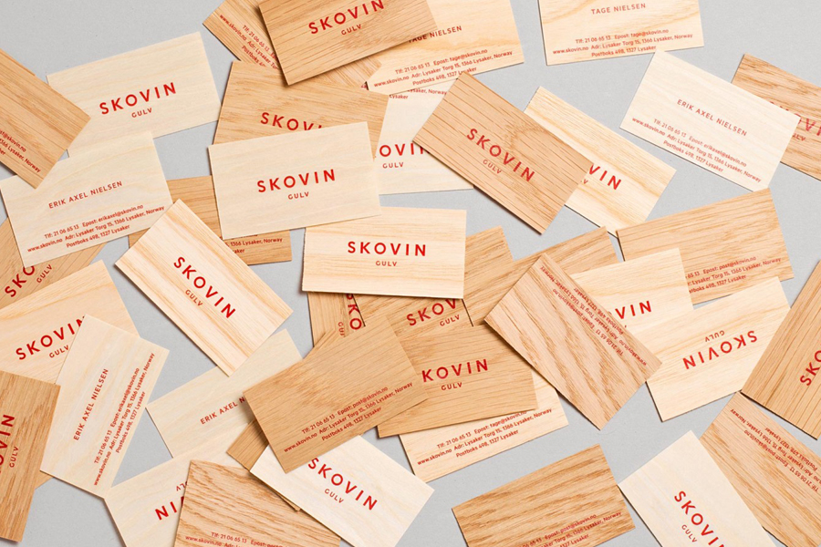
Skovin by Heydays, Norway
Design studio Heydays goes for clarity, universality and natural variety in their work for Norwegian floor specialists Skovin, creating business cards from wood veneer.
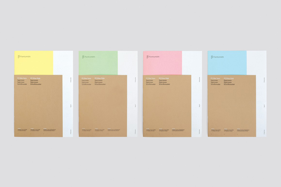
FS Silas Launch Campaign by Believe In, United Kingdom
Believe in, for their work on the FS Silas launch campaign, created a concept that draws its inspiration from the dossiers and secret files of espionage, as well as type specimens of the 50’s and 60’s. This is expressed materially in the combination of pastel coloured papers and manilla folders and boards.
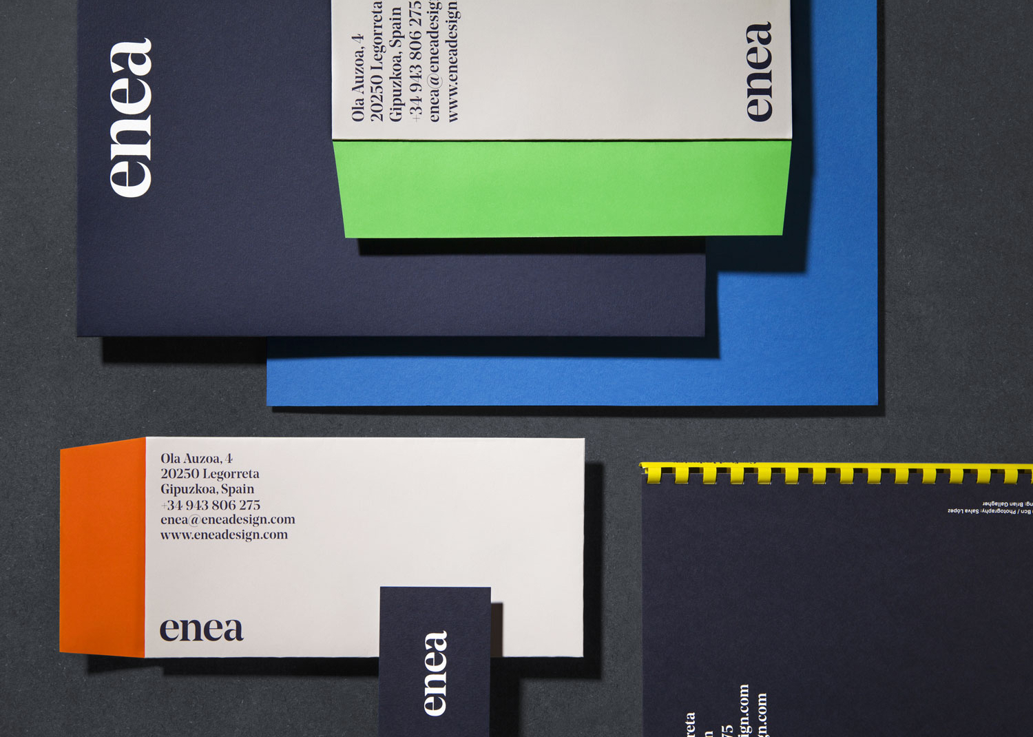
Enea by Clase bcn, Spain
Rather than the glossy catalogue of corporate business Class bcn give contemporary furniture design and manufacturing company Enea a smaller crafted quality in the use of uncoated material choices, different paper sizes and simple binding.
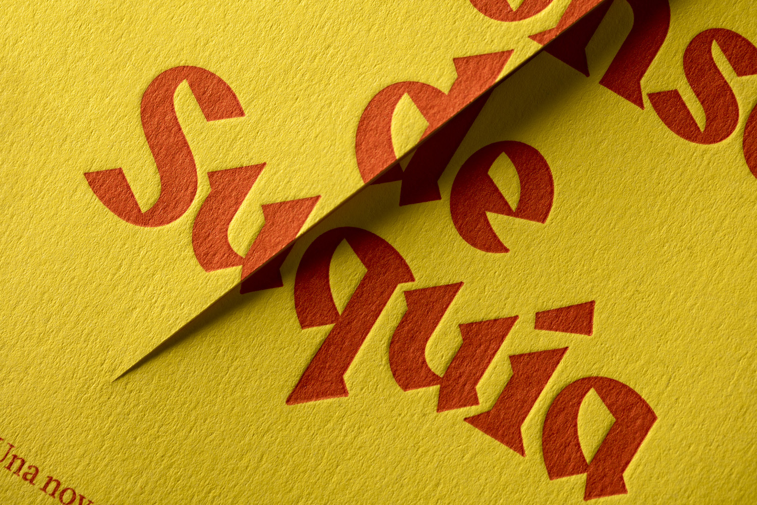
Don Alonso de Suquía by Bermudez, Porta & Casasus, Spain
Bermudez, Porta & Casasus slice through the cover of a limited edition novella to playfully convey the profession of protagonist and swordsman Don Alonso de Suquía. The material texture and debossing of the cover, alongside colour and typestyle, effectively plays with period and setting. It has a conviviality and unusual quality to it, of the smile in the mind variety that largely avoids the gimmicky in the overall restraint and communicatively concise nature of the job.
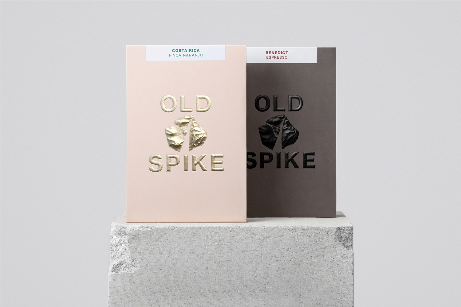
Old Spike by Commission Studio, United Kingdom
There are a few of neat ideas at play in Commission Studio’s work for coffee roaster Old Spike. Some are universal like the use of a block foil, high quality boards and the structural language of luxury boutique shopping bags. Some are subtle and conceptual like naming (a reference to the former workhouse the roaster now inhabits) and the connection between hard manual labour and premium quality. Others are practical, such as structural design that satisfies a need for strong shelf presence and a robustness for subscriptions sent out by post.
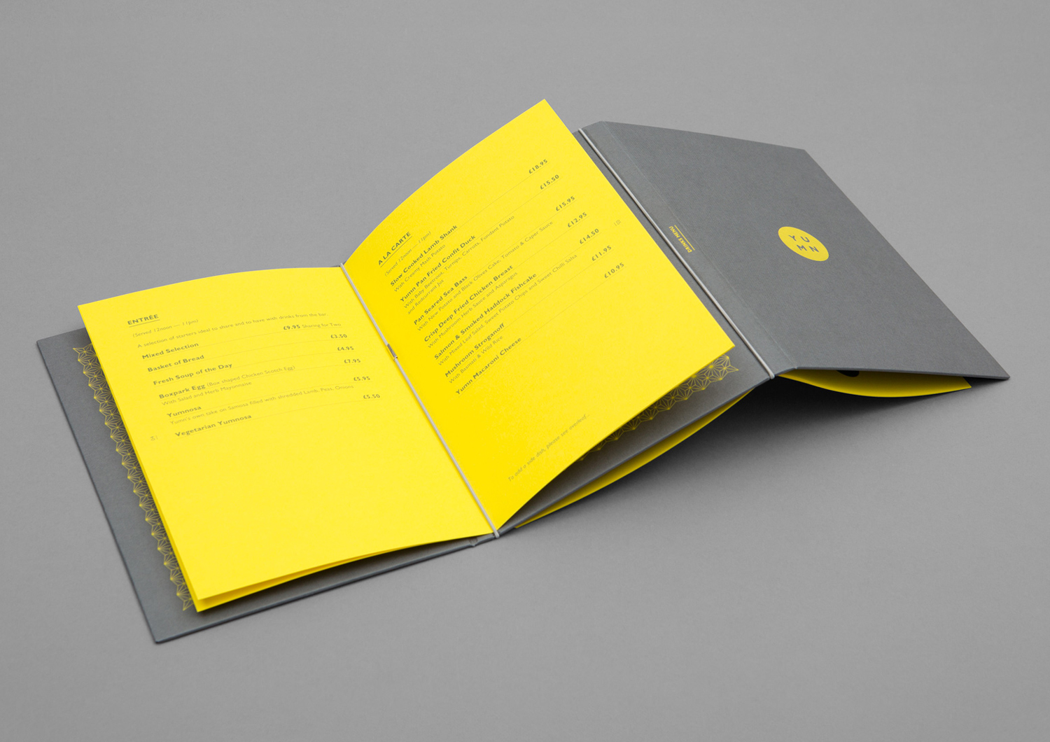
Yumn by Filthymedia, United Kingdom
Filthymedia draw on and reinterpret the industrial associations of Croydon’s Boxpark as high visibility yellow papers and concrete grey boards to punctuate the traditional material flourishes of restaurant Yumn.
Sant Francesc by Mucho, Spain
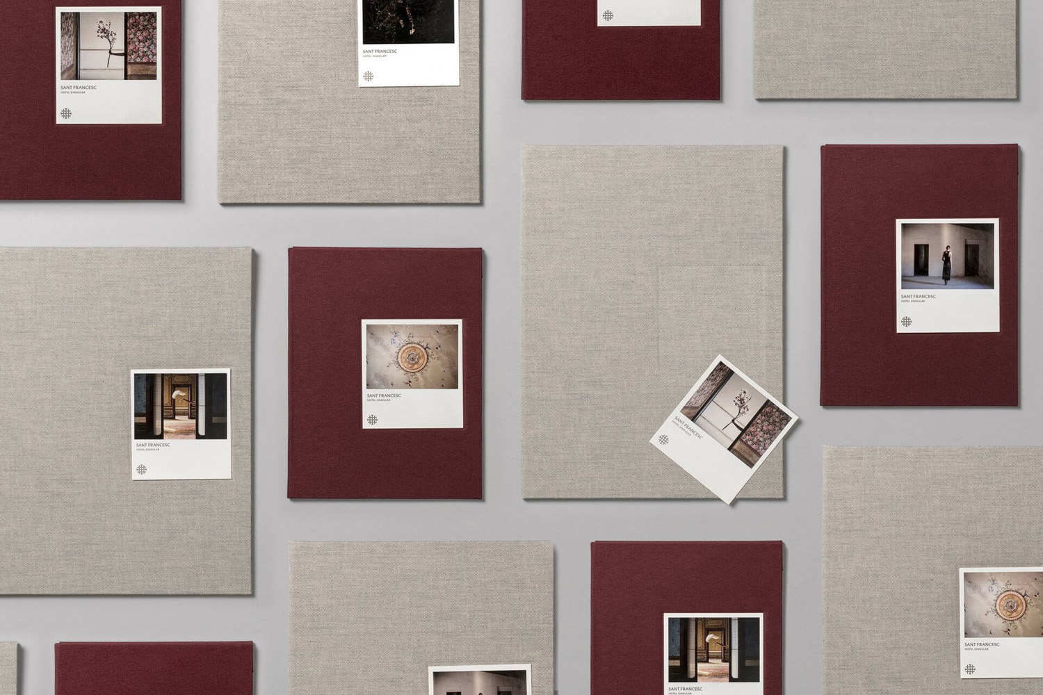
Mucho draws on the materials and colours of the local area to build the visual identity for hotel Sant Francesc. This is paired with snapshots of the hotel’s unique interior to create a rich and layered design of visual and physical texture.
Park Restaurant & Distillery by Glasfurd & Walker, Canada
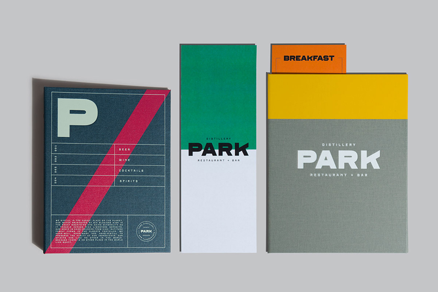
Glasfurd & Walker, inspired the robust, utilitarian and often bright qualities of hiking clothing and camping equipment, build a visual identity of colour and material weight.
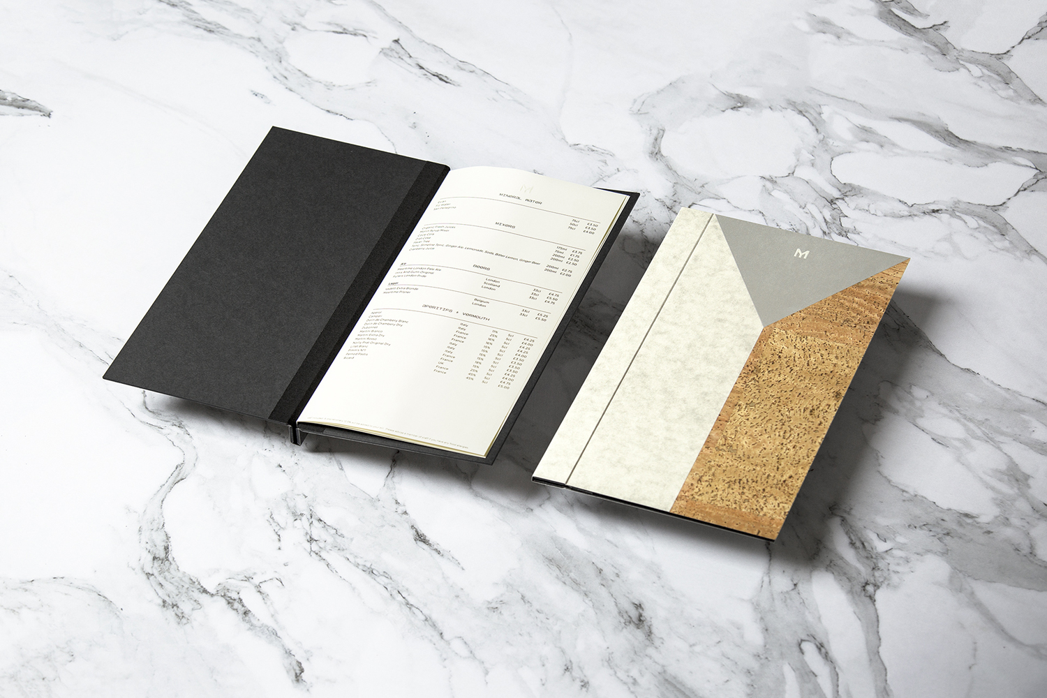
Brewdog Menus by O Street, United Kingdom
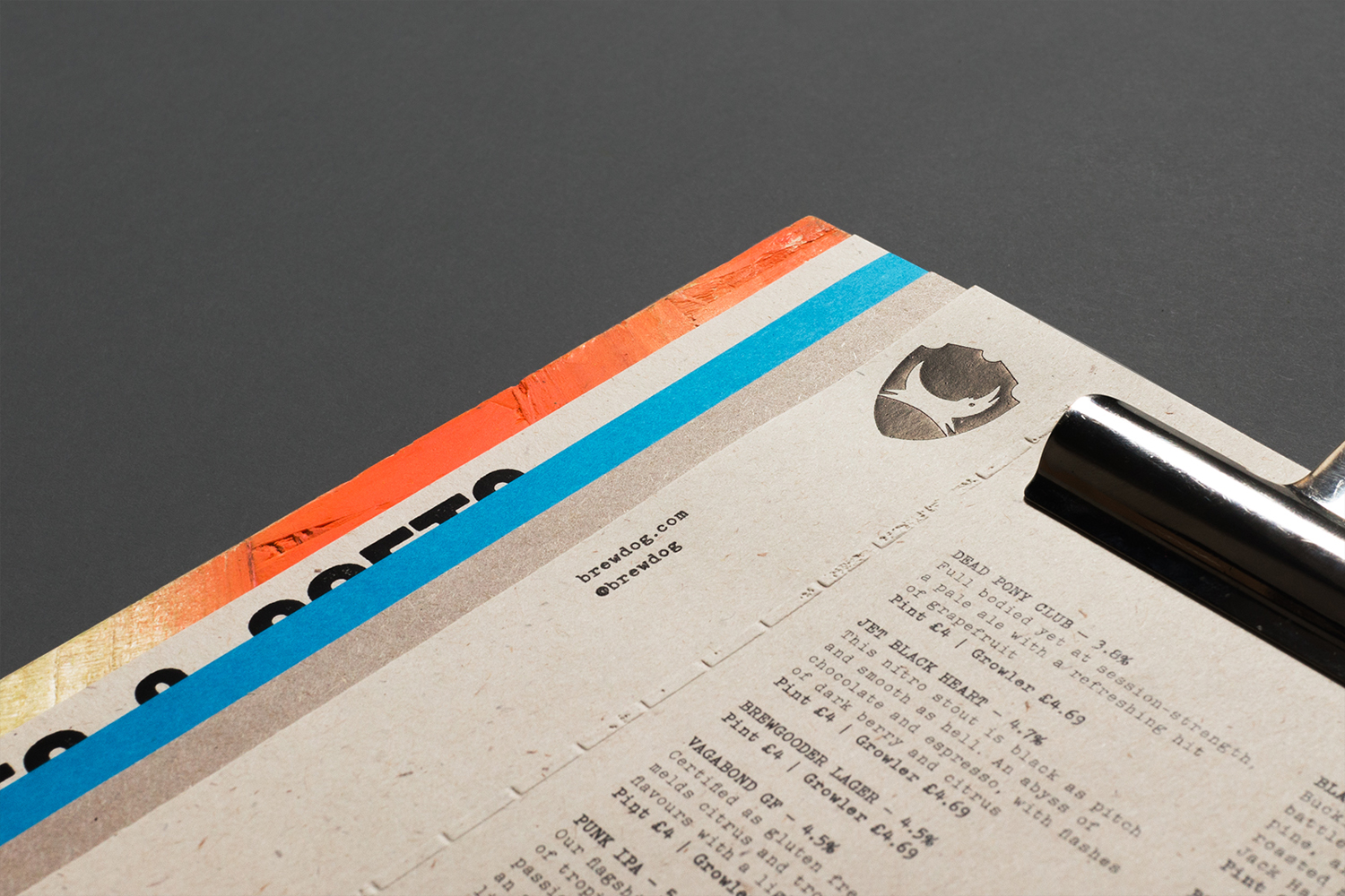
By bringing together dyed and mixed-fibre boards, blind emboss and block foil print finishes, and one-off spray painted chipboard backs, Brewdog’s new menus, a collaboration between design studio O Street and Brewdog staff, channel and express the “renegade” attitude of brand and the crafted qualities of its brews.
Gold—Smidt Assembly by Re-Public, Denmark
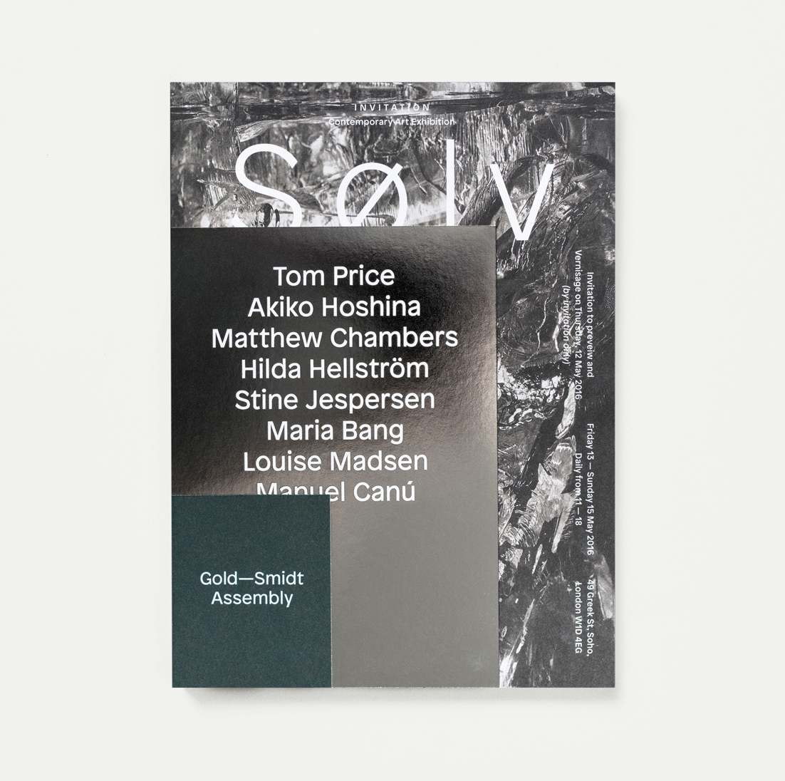
The process of layering is a key asset in Re-public’s visual identity for Gold—Smidt Assembly, and functions as a concept to link both the consultation and curatorial roles of the gallery. Highlights include the layering of signage, which mixes illumination and reflection with printed elements. And the composition of invitation which blends uncoated and reflective papers and boards, and uses the proportion and size of collated pages to interrupt, compare and contrast, much like swatch book.
L’Observatoire International by Triboro, United States
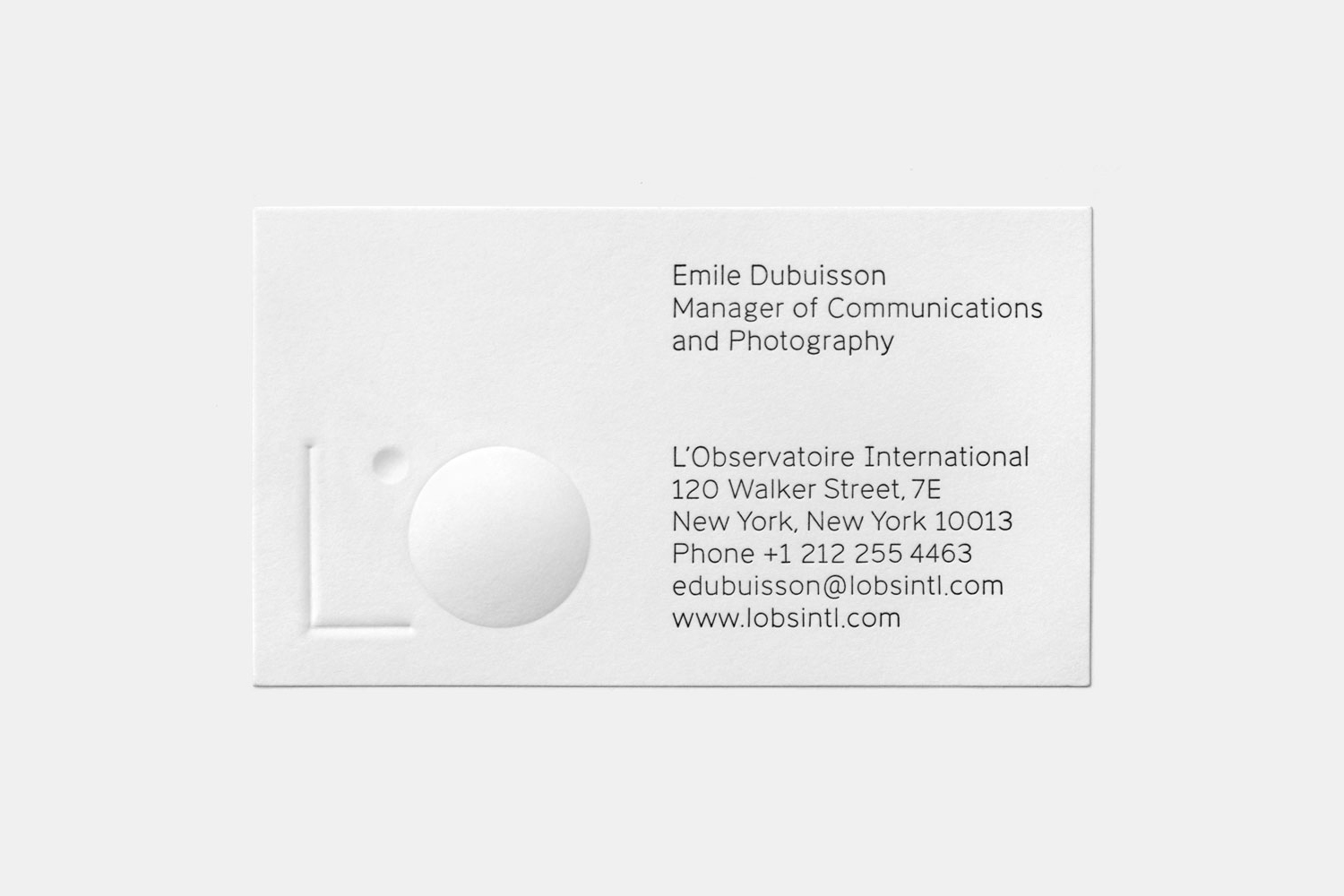
Triboro’s work for architectural lighting specialists L’Observatoire International effectively plays with light and shadow. This is expressed in print using a blind deboss and emboss print finish across an uncoated white board, casting shadows and creating highlights in different directions as the card is tilted. This is translated online as an animation tied to the time of day.
Brewdog’s Lone Wolf by B&B Studio, United Kingdom
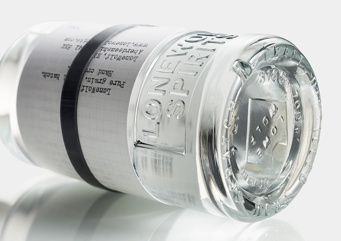
B&B Studio find an interesting balance between an initial rudimentary impression; an expression of experimentation and batch production, and an element of craft, in the mixing of loose label and rubber band, the tactile high qualities of a deboss and block foil print finish, as well as a bespoke structural design.
The True Honey Company by Marx Design, New Zealand
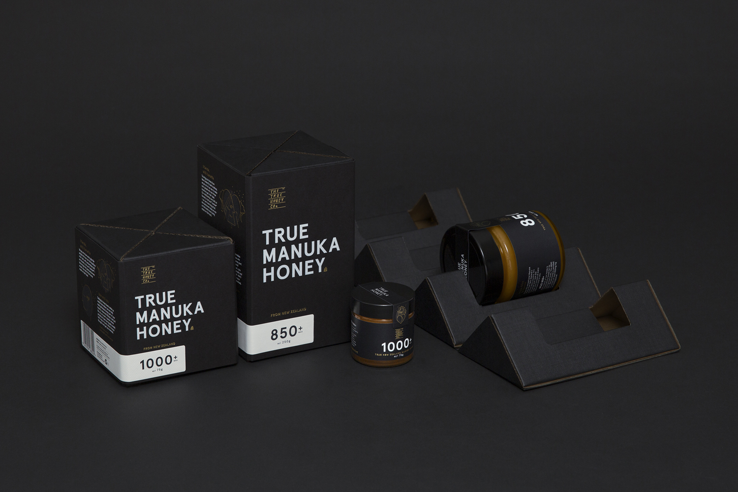
Rather than fine delicate detailing, layers of wrapping and a bunch of materials and print finishes, Marx Design use the vernacular of structural robustness, material weight and bespoke shape to convey the value of the product within.
Wadha by Two Times Elliott, United Kingdom
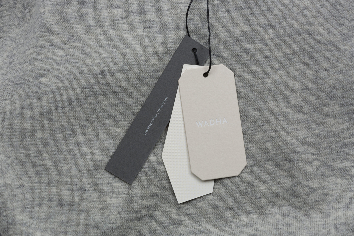
Alongside unusual and tactile material choices and high quality print finishes, Two Times Elliott also use cuts to create contrasting shapes throughout their work for Wadha, channelling something of the fashion label’s unique fabrics, distinctive forms and architectural silhouettes.
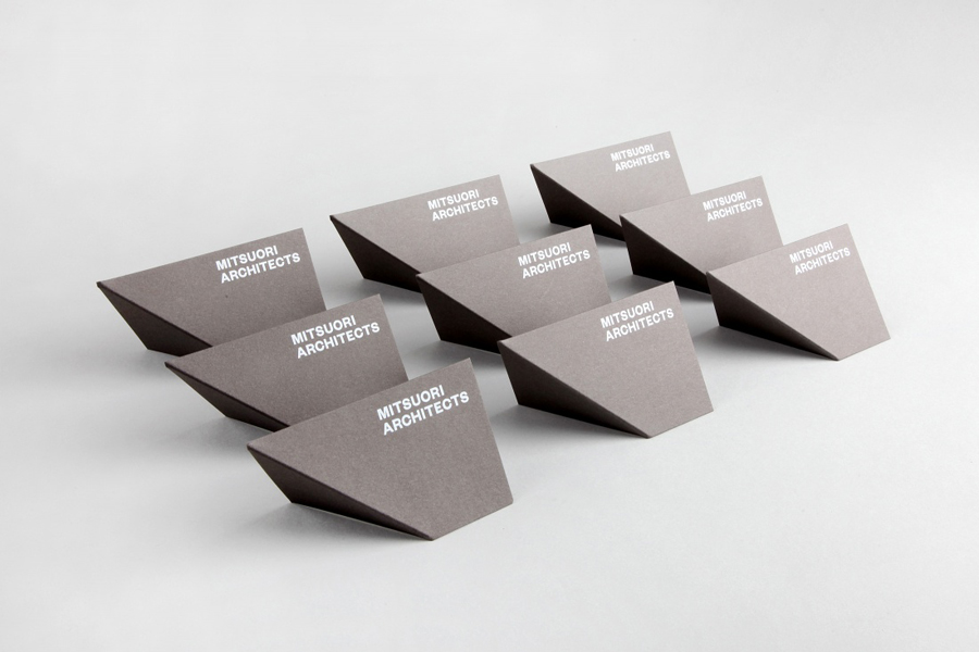
Mitsuori Architects by Hunt & Co, Australia
It is a small but relevant gesture that, rather than expressing the light and shade that gives shape to architectural structure and space through the use of colour or blind embossing, Hunt & Co. employ a simple fold.
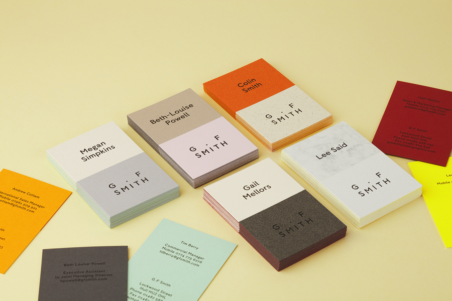
G . F Smith by Made Thought, United Kingdom
Made Thought elevate the individual and occasionally nuanced material qualities, surfaces and colours of G . F Smith’s paper range using contrast, achieved through a paper marquetry technique; the inlaying of papers and boards.
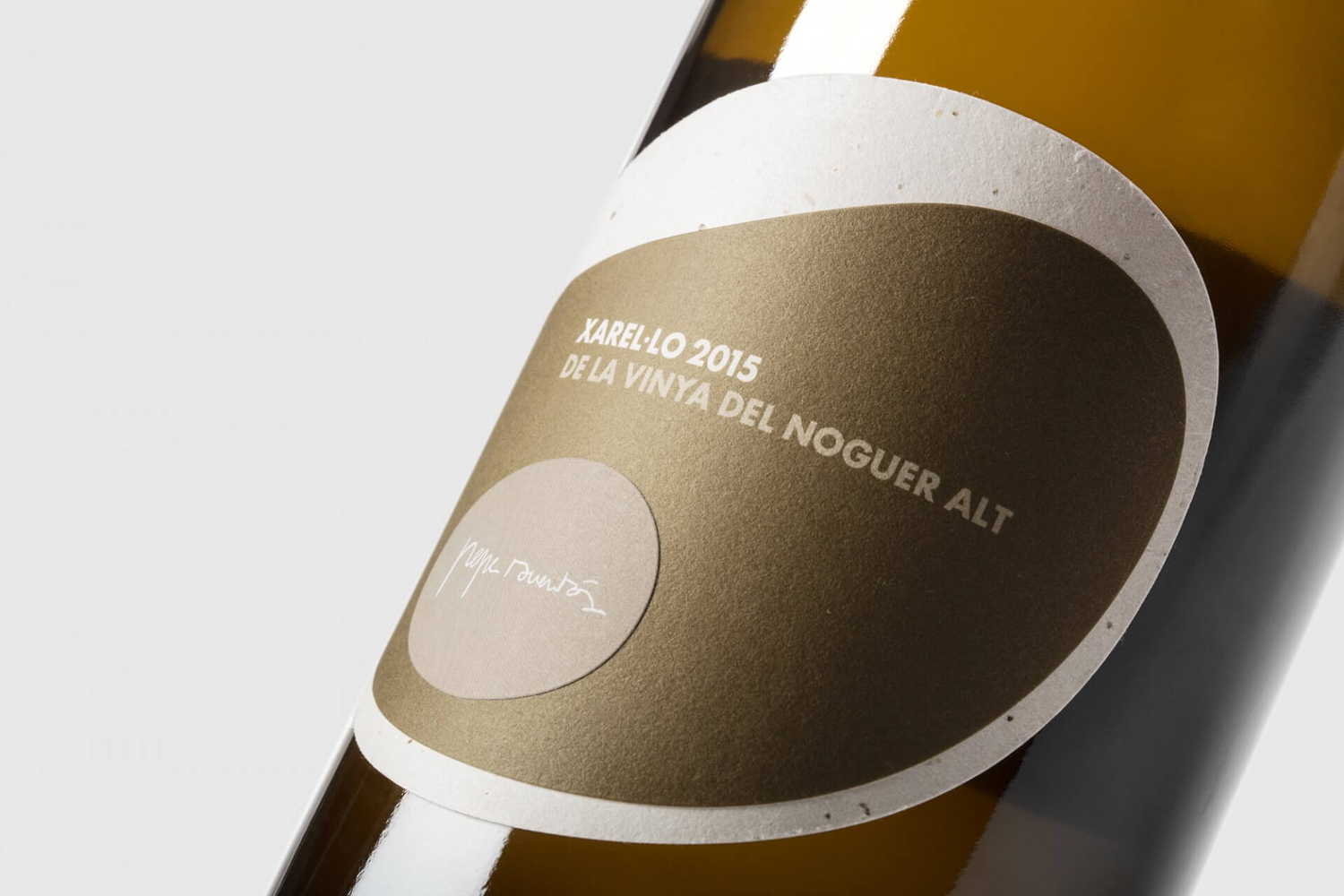
Pepe Raventós Natural Wines by Mucho, Spain
Using organic shapes, the topographical qualities and colours of layered paper and a base of mixed-fibre board Mucho draw together and express the themes of unique terroir, natural ingredients, minimal intervention and wine craft in a compelling and unusual way for vintner Pepe Raventós.
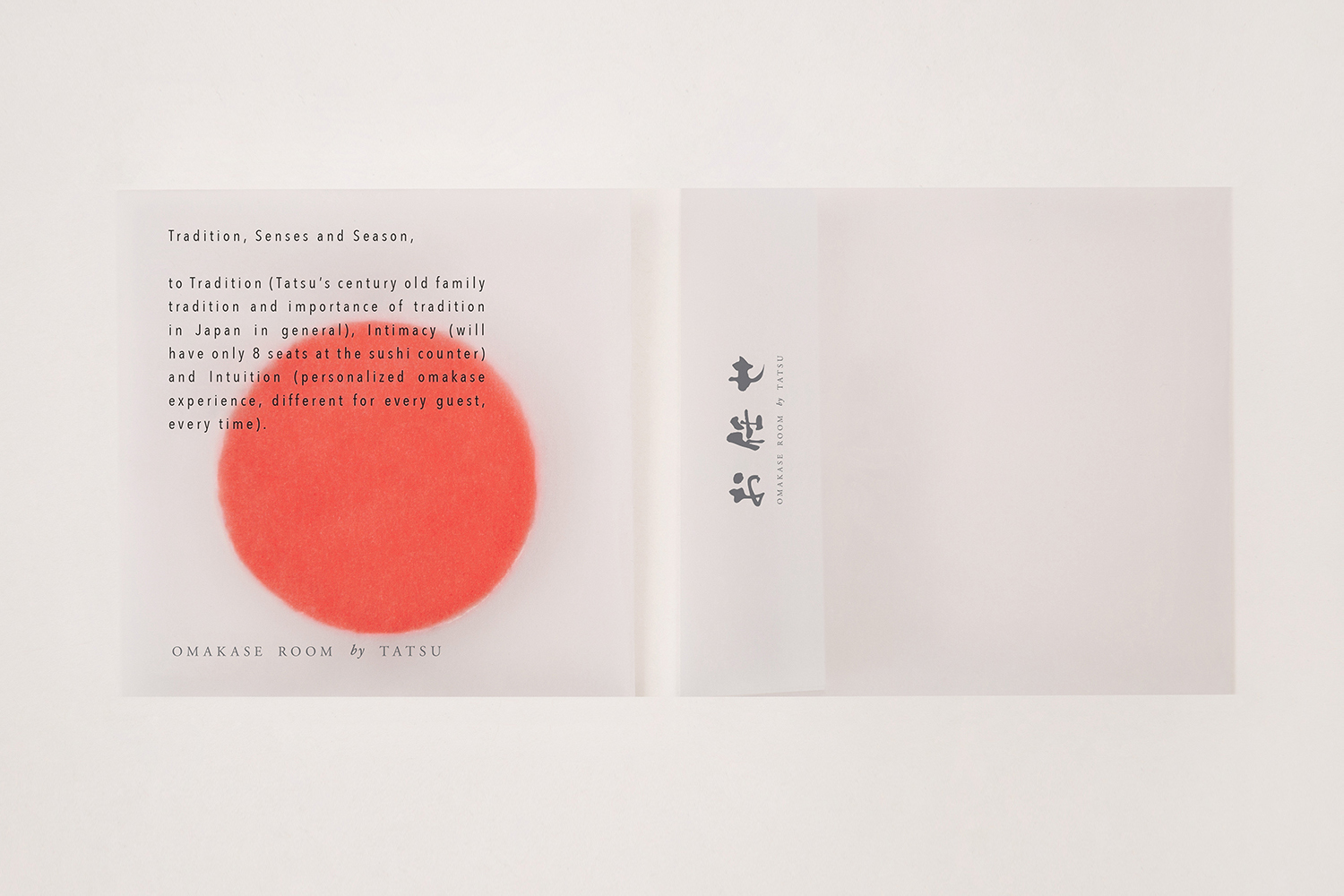
Omakase Room by Tatsu by Savvy, United States
Savvy draw on the individual and personable qualities of restaurant Omakase Room’s menu and its traditional Japanese minimalism and convey these thought visual identity using a few but well chosen graphic devices and materials, one of which is a semi-transparent rice paper that allows type and the material qualities of the interior and the hands of the diner to intersect.
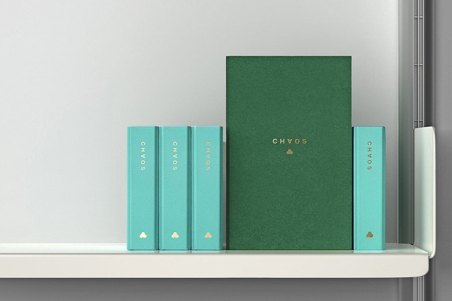
Chaos by Socio Design, United Kingdom
Socio Design, for their work with accessory brand Chaos, makes a connection between the precious and personal items hidden away inside a book and the luxury and personalised nature of Chaos’ products. This is augmented by uncoated papers and boards, and gold block foil print finish.
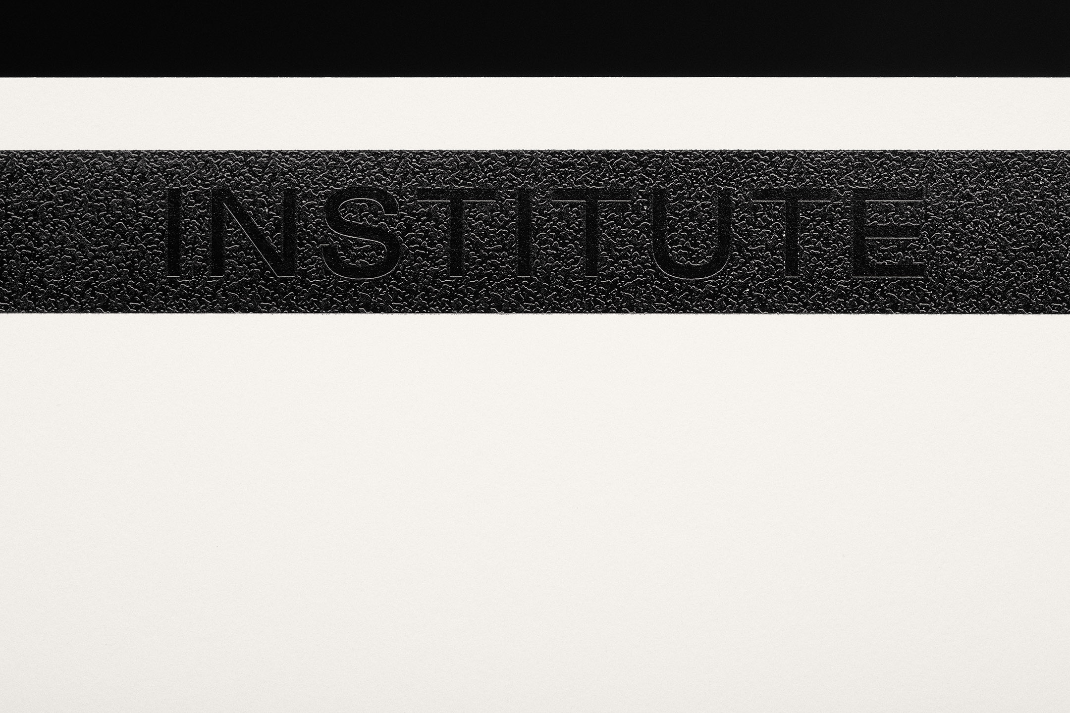
Institute by Commission Studio, United Kingdom
Opportunity and anonymity are touched upon in Commission Studio’s visual identity for Institute. This is expressed by a graphic device inspired by magnetic strips—a tool for opening of doors—and in a security pattern that hides logotype, conveying something of the studios low key positioning but high profile clients, implemented using a microfilming technique.
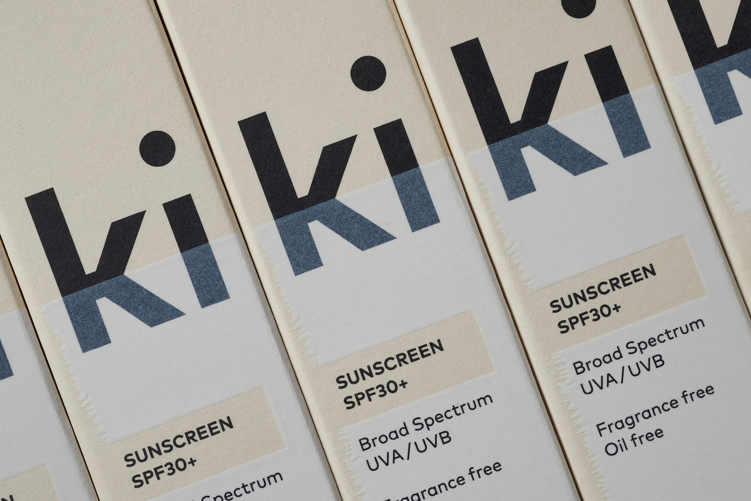
Ki Sunscreen by Akin, New Zealand
Akin draws an interesting and unusual stylistic impact from a universal experience—the application of cream—and finds a good balance between bold initial impression and a subtle detail up close in the interplay between the graphic and the material, founded on the clinical and cosmetic positioning of brand.
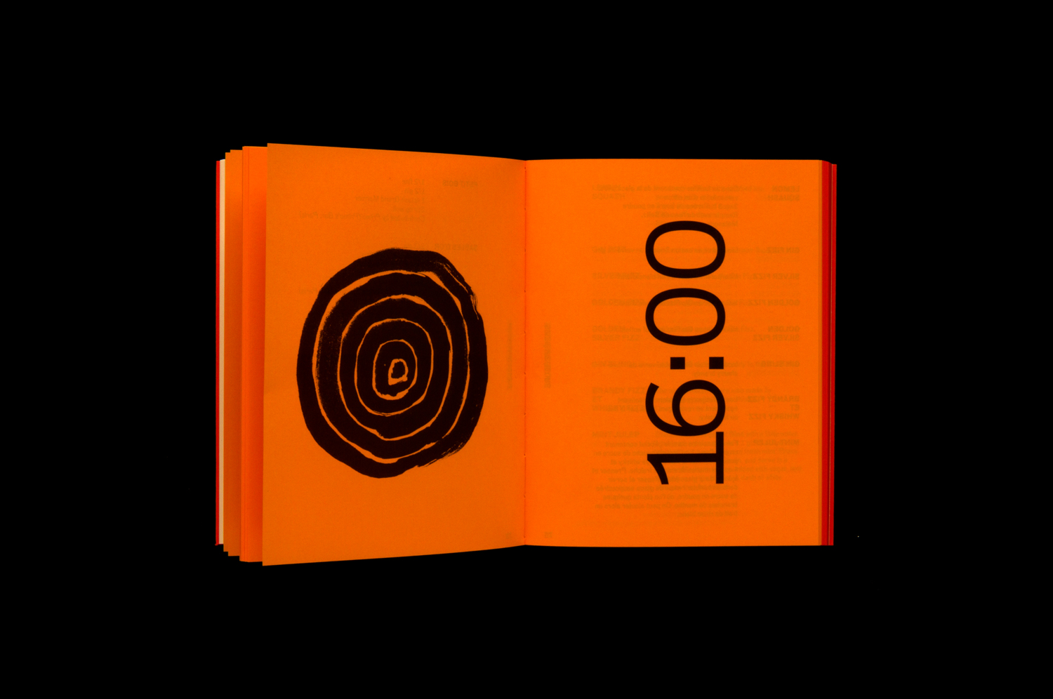
Corps Reviver & L’Heure du Cocktail by Spin, UK
Design studio Spin, augments page numbers with a horological quality using a gradual change in paper colour, tying cocktails to the time of day for the reprinting of L’Heure du Cocktail, .
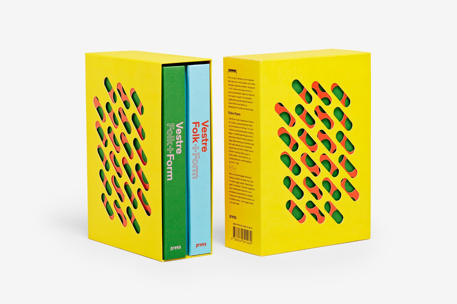
Vestre Anniversary Book by Snøhetta, Norway
Using modern and contrasting colour, pattern and block foil, and in the layering of materials by way of die cuts, Snøhetta’s book channels many of the material qualities and design language of Vestre’s catalogue. The die cuts are a particular highlight. These take the practical need for traction and the function of drainage in outdoor seating and elevate this to something playful and stylistic.
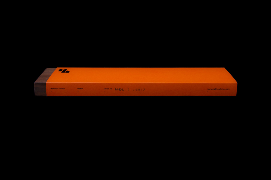
Matthew Hilton by Spin, United Kingdom
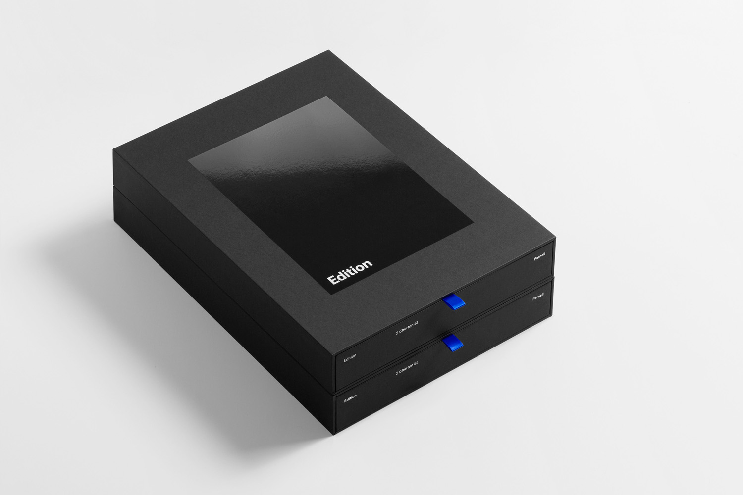
Edition by South, New Zealand
Graphic design studio South were commissioned to create a visual identity for luxury apartment development Edition that would assist the real estate team in presenting the project to potential buyers, and help, in conjunction with the building’s distinctive structural and interior design plans, elevations and renderings, to distinguish Edition within a crowded market.
With the intention of capturing the essence of the building, and informed by the spacial, visual and material language by architects Monk Mackenzie, South created a brand identity of light and reflection, moments of contrast and correlation, and a recurring rectangular motif.
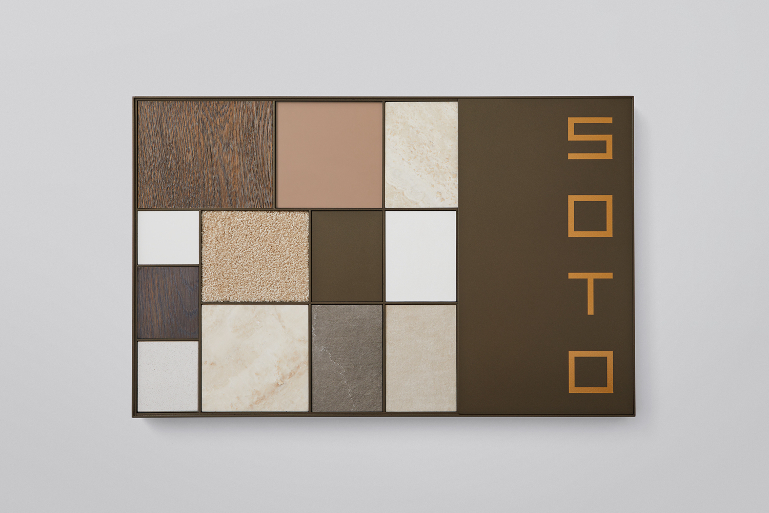
Soto by Richards Partners, New Zealand
Richards Partners turn the material samples of New Zealand luxury property development Soto into a distinctive component of graphic identity—based around a confluence of Japanese Zen elements—through form and arrangement, harmony and contrast.
Strömma Arkipelag by 25ah, Sweden
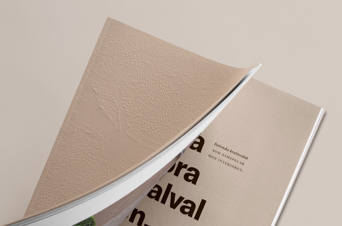
25ah explore the critical relationship between the modern design and materiality and natural beauty in their work on property development Strömma Arkipelag. The blind embossing of cover finds a neat balance between a large and forested landscape, and the finer details and design craft of interior design.
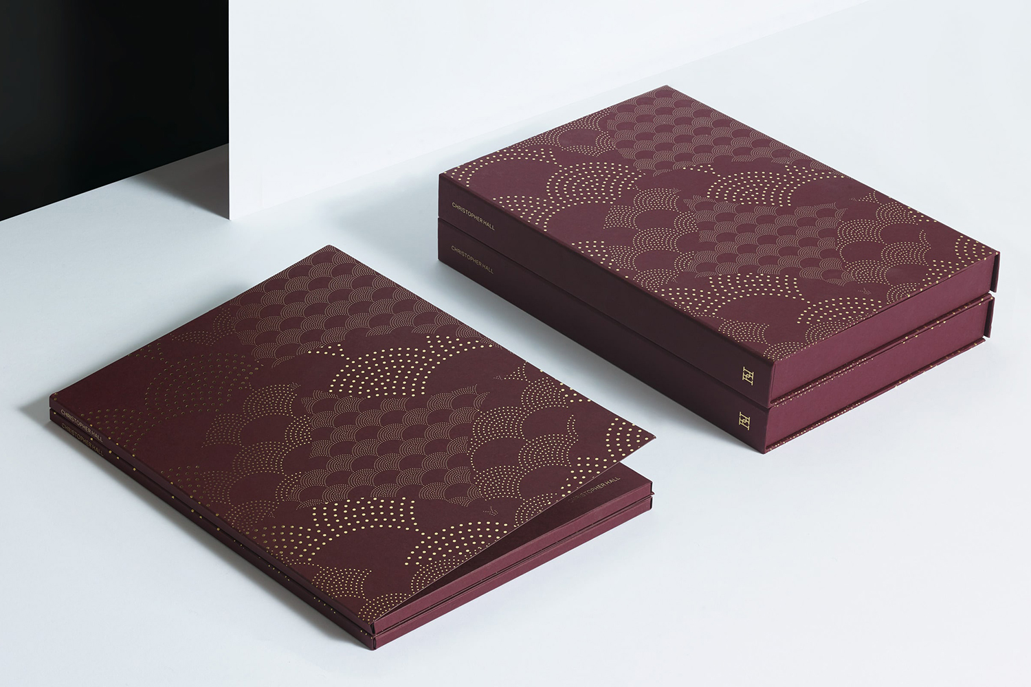
Christopher Hall Somata Collection by Two Times Elliott, United Kingdom
CareerTrackers Awards by Garbett, Australia
