The Best of BP&O — September 2017
Opinion by Richard Baird Posted 29 September 2017
September’s highlights included Lundgren+Lindqvist’s work on Daniel Götesson’s art book Ekta Sketchbooks Vol. I–III and Bond’s visual identity for Finish student union Sakki. BP&O also took a Hands On look at Snøhetta’s work on the Vestre anniversary book Folk+Form.
There were, however, five projects that stood out, and have made it into BP&O’s Best Of Series. These typically balance a strong singular concept, or an appropriate confluence of ideas, with a compelling stylistic character and clear communicative intention that appropriately plays with form, colour, type and layout, as well as material, texture, image and print finish.
Throughout the month BP&O also continued to expand on its collections series as another way to jump through to older posts on the site. New additions to this were Film, Die cutting and Beer. Updated projects in September included Paul Belford’s brand identity and packaging for Soap Co.
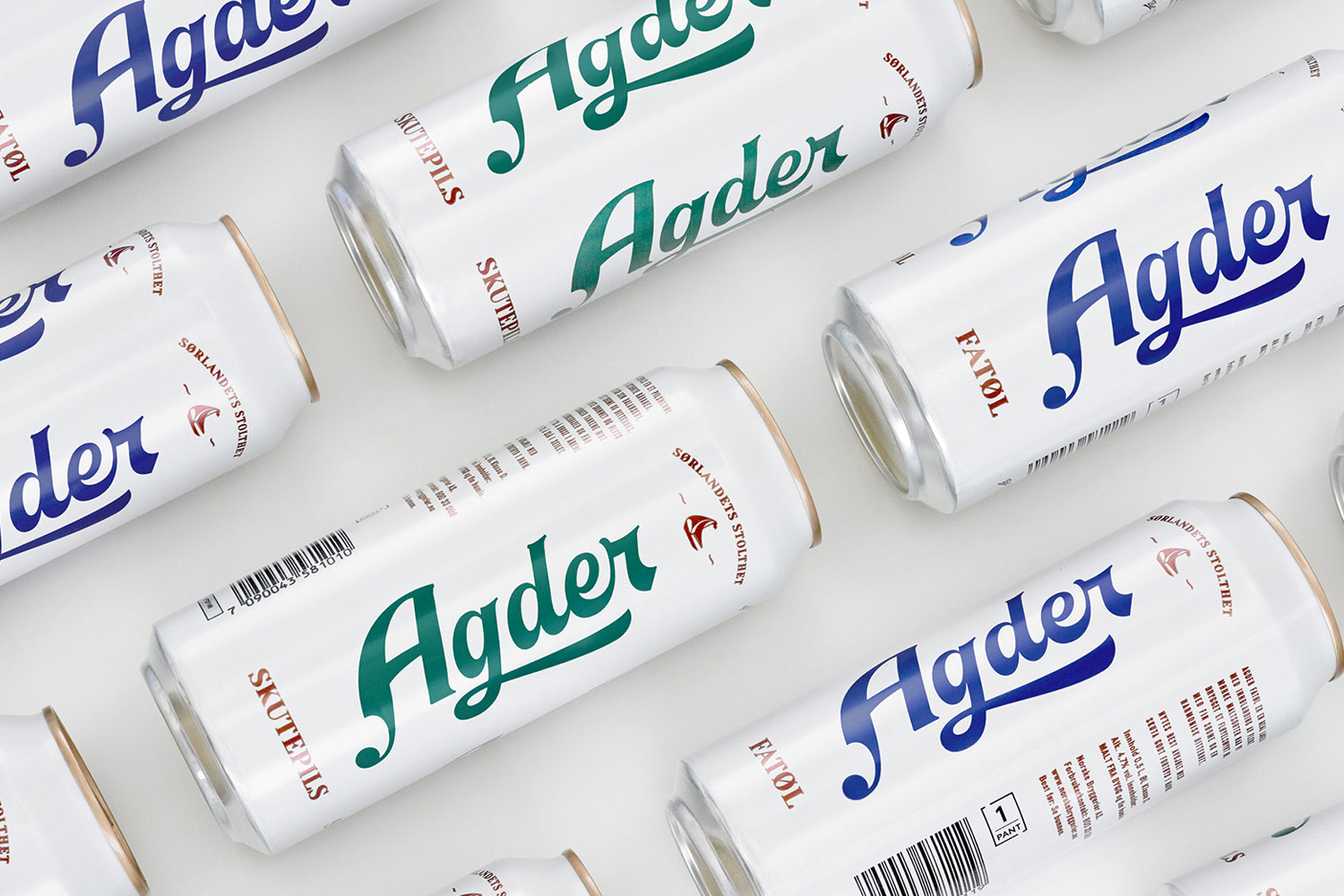
Agder Bryggeri by Frank, Norway
Agder Bryggeri is a historical name amongst breweries throughout Norway. It was first established in 1900 but was closed down in 1904 due to operational problems. Recently, the brewery has been resurrected as part of Norsk Bryggerier’s commitment to local beer brands, and is sold throughout the Agder counties of southern Norway. Oslo-based design studio Frank delivered brand strategy, concept, visual identity and packaging design for Agder Bryggeri. Taking inspiration from the “de hvite byene” or “white towns” in English, and the sailing heritage of the region, the studio delivered a characterful, sea-breezy and minimalist design through the handwritten character and flourishes of a logotype, blue and green ink and a white background.
See more of this project here
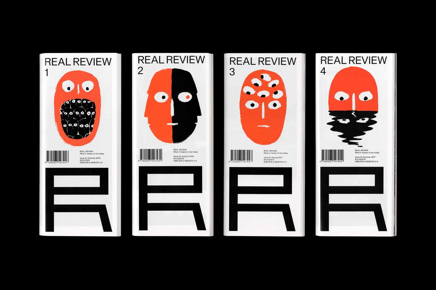
Real Review by OK-RM, United Kingdom
Real Review is an award-winning quarterly magazine that pursues what it means to live today through analysis, evaluation and enquiry. It is a collaboration between London-based design studio OK-RM and editor Jack Self, the founder of architectural practice and cultural institute Real. Real Review offers wide ranging comment on a variety of topics, is presented in a compact format and mixes dense text, image and moments of space with the intention of being an efficient, economical and readable format.
See more of this project here
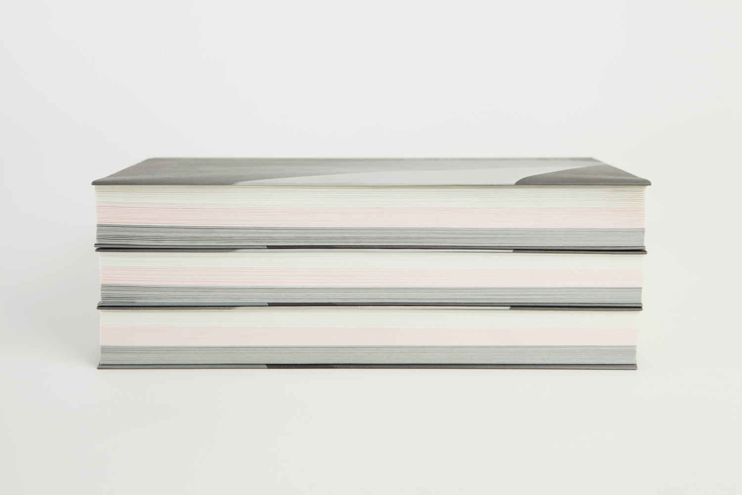
Rain, Gravity, Heat, Cold by Blok, Canada
Superkül is a Canadian architecture studio with a diverse portfolio of understated boldness, subtlety and spacial richness, rooted in a process that intends to find the essence of each project and remain true to this throughout design and development. To celebrate the studio’s first ten years Superkül worked with Blok to create Rain, Gravity, Heat, Cold, a book that would serve as a collection of work and as a tool to articulate the firm’s unique philosophy and design approach. This was an exercise in discovery and positioning which then was expressed materially through paper transition, finishes and printing techniques.
BP&O takes a hands on look at Rain, Gravity, Heat, Cold. This follows, and intends to augment, the initial impressions given by Blok’s press release and promotional images, as reviewed in BP&O’s earlier article.
See more of this project here
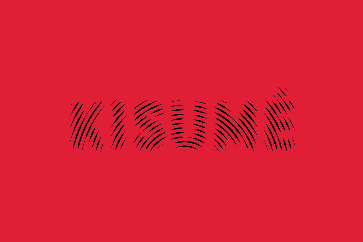
Kisumé by Fabio Ongarato Design, Australia
Kisumé is a Japanese restaurant located on Melbourne’s Flinders Lane. It is described by Fabio Ongarato Design, the studio behind its visual identity, as an unconventional, slightly twisted and artfully executed experience. The restaurant intends to immerse guests in an intriguing view of Japanese traditions, and fuses these with the owner’s obsession with beauty and sensuality. This is expressed by a “brutally sophisticated and minimal interior design” created by Wood Marsh Architecture which features curated artworks by Japanese photographer Nobuyoshi Araki as well as Polly Borland, and in the break from the conventions of a typical Japanese dining experience in the movement and colour of visual identity. This links business cards, stationery, menus, window and lighting decals, posters and website.
See more of this project here
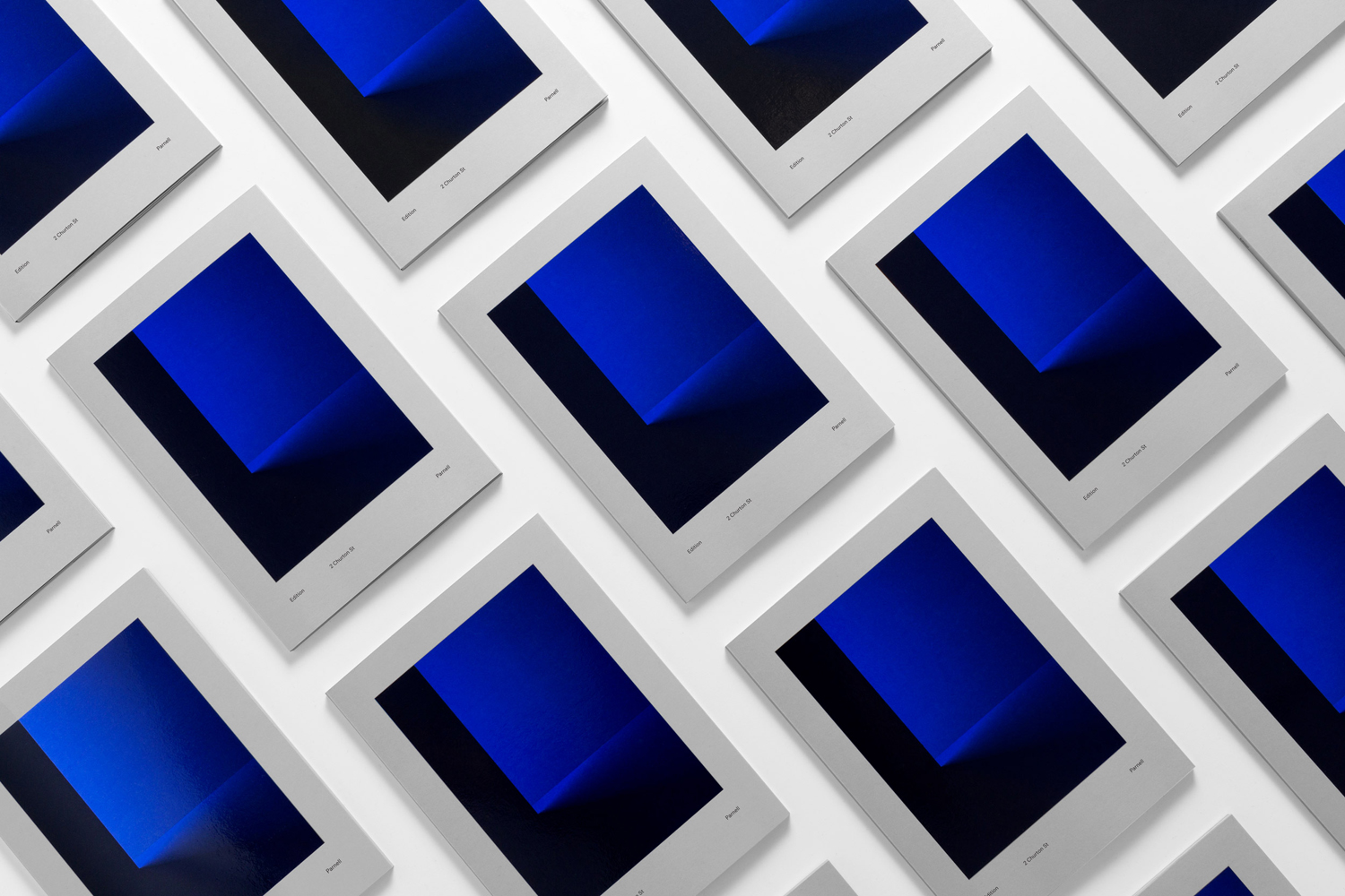
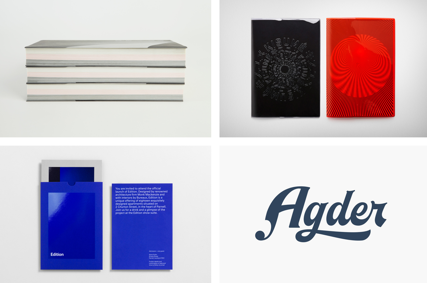
Edition by South, New Zealand
Edition is a new property development by LEP Construction. It will be located in Parnell, a suburb of Auckland, New Zealand, and made up of 18 luxury apartments designed by architects Monk Mackenzie with a eye for flexible space and changing natural light. Edition will make the most of a sloping site, feature three levels cantilevered above ground and create what are described as “view shafts” from street right through to the harbour beyond. This modern structure, and sensitivity to its context, is complimented by a luxury interior design, created by Bureauxe, of both contrast and continuity, in materials, surface textures, colour and form.
Graphic design studio South were commissioned to create a visual identity for Edition that would assist the real estate team in presenting the project to potential buyers, and help, in conjunction with the building’s distinctive structural and interior design plans, elevations and renderings, to distinguish Edition within a crowded luxury apartment market.
With the intention of capturing the essence of the building, and informed by the spacial, visual and material language of Monk Mackenzie, South created a brand identity of light and reflection, moments of contrast and correlation, and a recurring rectangular motif. This links a variety of marketing materials that included brochure and brochure sleeve, sales book and box, invitation, floorpans, buyer gift and business cards.
See more of this project here

