Richard Baird
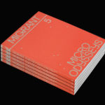
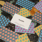
Migrant Journal No.5 by Offshore Studio
Migrant Journal is a six-part exploration of migration in all its forms. It covers, as you might expect, the current and pressing political and socio-cultural implications of the mass migration of people, yet also delves deeper into the more abstract movement of ideas, power and information around the globe. Migrant Journal, in its breadth but a continuity of theme, intends...

Unfolded by Commission
Unfolded is a design and print festival that celebrates the creative work happening across Europe in the disciplines of design, printing and brand communication. This was held by and at The Gmund Paper Factory in Germany on the 9th November 2018. The event created a space for sharing ideas and fostering dialogue between creative individuals, providers of printing services, brand...
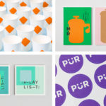
BP&O Collections — Spot Colours
A continually updated gallery of graphic design, visual identity and packaging work, reviewed and published on BP&O, that employ a distinctive use of spot colour. These include a finely detailed use of metallics, pages of solid bright colour and moments of richness. This post features work by Bond, Blok and Bunch, and covers a variety of projects, from books and...

Speculations On Anonymous Materials by Zak Group
Speculations on Anonymous Materials (2013), nature after nature (2014) and Inhuman (2015) is a trilogy of exhibitions, curated by Susanne Pfeffer, that took place at Fridericianum, Europe’s oldest public museum, located in the German city of Kessel. The exhibitions, which mark the institution’s turn towards post-humanist thinking, intended to demonstrate how current artistic practices shift the theoretical boundaries separating the...
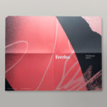
Everlea by Studio Brave
Everlea is a new property development described as a private sanctuary of townhouses located in the Melbourne suburb of Keysborough, an expanding community marked by its space and natural surroundings of native trees, shrubs, parkland and a landscaped network of safe pedestrianised streets. Developed by SB&G, working in collaboration with Bruce Henderson Architects, landscape architects Tract and Kathy Demos, Everlea “offers a pairing of design expertise guided by...
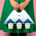
Tea & Glory by Socio Design
Tea & Glory are loose-leaf tea experts and are described as the antithesis of fast-paced coffee culture. In the same spirit of ancient tea drinking rituals, the brand is interested in the continued promotion of slow-living, a lifestyle that seeks to place more focus on the small details and experiences of everyday life. With a desire to better express this position Tea &...
Teatulia by Here Design
Teatulia is a Bangladeshi single origin tea brand that recently moved into the UK market, opening a flagship store, tea shop and cocktail bar in London’s Covent Garden. It is a social enterprise creating jobs in a remote region of Bangladesh and has, so far, transformed 3,000 acres of barren land into an organic tea garden. Drawing on Teatulia’s single-source positioning—common...
Schubertíada Vilabertran by Mucho
Schubertíada is an annual festival run by Associació Franz Schubert that celebrates the works of the 19th-century Austrian Romantic composer Franz Schubert. This takes place in the Spanish municipality of Vilabertran in July. The festival includes a programme of chamber concerts, lied recitals, instrumental solos and lectures. Schubert is known, not just for his compositions, but for his contribution to Lieder; German poetry...
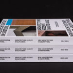
New Architecture in South Tyrol 2012—2018 by Studio Mut
New Architecture in South Tyrol—a travelling exhibition and catalogue—brings to light the unique architectural boom happening in Alto Adige, also known as South Tyrol, the predominantly German-speaking northern-most province of Italy. Selected by an international jury, the catalogue focuses on fifty-nine buildings from the region, realised between 2012–2018, and have gained local contemporary architects international recognition. These buildings are marked by...
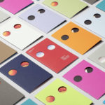
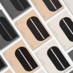
Anton&Anton Kioski by Bond
Anton&Anton (A&A) is an alternative to and antithesis of the large supermarket chains. Staff are described as relaxed, smiley and proud. Their ranges (mostly) organic, some homecooked and also available online for home delivery. With a desire to express an approachable, playful yet credible positioning, and a need to develop a cohesive set of packaging and communications assets A&A worked...
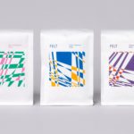
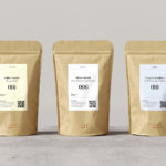
Felt Coffee by Studio fnt
Felt is a coffee shop in Seoul with their own brand of speciality coffee which has been sourced by way of direct trade and roasted in Gyeonggi-do, a populous (relevant later) province of South Korea. They opened their first store in September 2015 and a second in October 2018. The team at Felt see every part of the coffee experience;...
246 Queen by Studio South
246 Queen has a long and storied history. Opened in 1964 on Auckland’s Queen Street, it heralded a new era of modern architectural vision, exclusive boutique-based experience and an urban post-war retail sophistication. The building played host to fashion shows, designer concessions, furniture showrooms and contemporary dining. However, the architectural ideas drawn up by the original architects Rigby Mullan (Alan...