Hello Klean by Two Times Elliott
Beauty is, of course, in the eye of the beholder, but there’s no denying that objectively, its branding and identity design has undergone some huge changes over the past decade or so. Gone are the days of faux-luxurious designs that were all about swathes of abstract silk; women coiffured to within an inch of their life; a microscopic lens on...
Compound by DesignStudio
What does ‘healthcare’ look like today, especially when we’re increasingly talking about preventative treatment? For Parsley Health and GlycanAge, which promote functional medicine, it’s serene – all blush pink, forest green and rounded corners; for Modern Age, which focuses on longevity, it’s more clinical, with high-resolution botanical imagery and classical icons; Ezra, which offers full-body MRIs as cancer prevention, goes...

Yellowbird by Gander
Sauces, oils, seasonings and condiments are consistently thriving categories in direct-to-consumer packaged goods. These high-margin, shelf-stable products can be easily differentiated with unique flavours and ingredients, and have high branding potential that can quickly adapt to trends. Right now, hot sauce its having its moment, with celebrities from Ed Sheeran to Brooklyn Beckham jumping on the band wagon, following trailblazers...

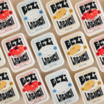
Bezi by Red Antler
Bezi was founded by Ilay Karateke – an Istanbul-raised, New York-based, ex-McKinsey consultant turned cheesemaker – and Hasan Bahcivan – a Berkeley-trained engineer from one of Turkey’s largest and most legacied cheesemaking families. Both grew up in large families, with their lives punctuated by big family-style meals shared with friends and neighbours. Labneh, a Middle Eastern spreadable cheese, was ever...
Wholy Greens by Control Studio
Wholy Greens is a B-Corp certified Dutch food brand dedicated to transforming the way people perceive and enjoy vegetables. Its mission is to create a mindset shift from ‘having to eat veggies’ to ‘genuinely loving veggies’ – and it uses pasta as its primary vehicle. It’s a smart set up, not least because, frankly, what experiences aren’t more enjoyable when...
Precise by Design Bridge
Mortgages aren’t exactly the most sexy or fun concepts, nor are the companies that offer them. Likewise, the sector isn’t exactly known for a bold or forward thinking approach to brand design. But it’s often the more traditionally dull-leaning brands or companies that make for the most creative – not to mention difficult – branding projects. Perhaps that’s part of...
Uoga Uoga Kids by andstudio
Since 2019, sales of beauty products labelled ‘clean’ have soared in popularity, and – as with all consumer trends, from interiors to fashion design – parental preferences influence the marketplace for children’s products as much as adults’. Enter Uoga Uoga (which translates to ‘Berry Berry’), a Lithuanian natural beauty and skincare company founded in 2010 that produces mineral-based makeup as...
Joyful Outdoors by Alphabetical
Over the years, London-based Alphabetical has honed both a distinctive style and a distinctive client list: often, its most celebrated projects are those for brands or organisations that are both a unique place, and more specifically a site for a community that’s underserved or underrepresented. In short, Alphabetical has honed its knack for uniting a people-centric, frequently cocreation based approach...

Bikedot by Studio Sutherl&
The concept of a brand today rarely has a sense of physicality. The hand (or indeed roller), the mark-maker, usually feels totally absent. It makes sense really, considering our primary interaction with a brand is often online; but when a project comes along that’s so obviously delighting in the possibilities of print processes, inks and paper it feels like a...
Coolhaus by &Walsh
Dessert-centric power couple Natasha Case and Freya Estreller met in around 2008, soon forming a partnership in both life and business: Coolhaus, a range of ice creams and other frozen treats that looks to inspire other female and LGBT+ founders. For those thinking, ‘what, like Rem Koolhaas?’ – yes, you’re right. Estreller originally trained as an architect, and before Coolhaus-proper...
Hanbury by Base Design
Hanbury is an American architecture firm, founded in 1979 and based in Virginia. According to international agency Base Design, which recently delivered a rebrand for the practice, the last decade has witnessed a ‘transformative’ period of growth and diversification with the team increasing from 40 to 160 individuals, and expanding from one to eight office spaces. For Hanbury, which started...
Isle of Wight Tomatoes by B&B Studio
Having grown up near Portsmouth, the Isle of Wight carries a certain resonance, though perhaps unfairly. Aged around 14, when getting served in off licences/particularly lax pubs wasn’t always a given, we’d sometimes pass the time watching the IoW ferry. It felt rather bleak, and somehow a bit futile, just bobbing back and forth between two destinations (Southampton and Cowes)...