Logo
Circular Economy Institute by FORM Brands Studio, 2026
The Circular Economy Institute was established t0 help drive an economic transition from linear to circular through training and a global community. It does this by equipping industry leaders and entrepreneurs with the knowledge and connections to reshape economies, redefine sustainability and build a more resilient future. Circular thinking, community and collaboration form the basis of the company’s new logo,...
Logo
Learn Canadian by ARK Agency, 2026
Learn Canadian intends to capture what makes studying in Canada genuinely unique; its world-class institutions and stunning natural landscapes, but also highlighting the country’s distinctive spirit of openness, inclusivity, and creativity. As described by ARK Agency, the brand has been crafted to feel, not just inform, taking a creative approach that ‘blends cinematic storytelling with digital-first engagement’. From hero films...
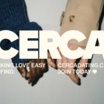
Dating Apps Go Full Cerca
It wasn’t too long ago that we were deluged by think pieces bemoaning the state of dating apps; detailing their fall-from-favour in data that showed in cold hard numbers that their popularity had long since boomed. The swipe-laden online dating world, it seems, was drastically waning. All sorts of theories flew around: maybe Gen Z – frequently (bafflingly, implausibly) lauded...
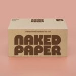
BP&O Voices
Packaging:
Cleaner Take On The Dirty Work
A guest article written by packaging expert Lisa Cain. BP&O Voices presents the opinions of industry experts on a wide range of topics....
HotDog by SMLXL
From the moment I turned the sound up (as per instructions) on the ‘about’ page of the HotDog website, safe to say I was obsessed with this brand and its branding. It’s laugh out loud hilarious – I truly loled, as did the person I was sharing a room with, and as I’m sure anyone within eye- or ear-shot would...
Logo
Bedrock by Studio Everywhere, 2026
Bedrock develops autonomous vehicles for construction. To think this was science fiction not long ago is mad. Bedrock worked with Studio Everywhere to develop a visual identity for the company. This also included the design of a logo. And it’s got it all. Caterpillar tracks, a sense of excavation within the negative space, building up in the positive, and sense...
Upgrade to
BP&O Plus
Read more
Logo
Getty by Fred & Farid New York, 2026
As Getty has evolved, its existing identity no longer fully reflected the breadth of its work–art, research, conservation and philanthropy–or the diverse audiences it serves. The institution set out to create a visual identity that could better represent the many interconnected parts of Getty and deliver a sense of movement, energy and life. Getty worked with Fred & Farid New...
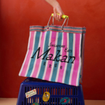
Yes we Makan
The chintzy rose; the bright but slightly dusky pink; the multifarious wordmarks; the apparently haphazard, painterly decorative flourishes; an approach to letter sizing that’s borderline unhinged – the branding for Makan has the potential to be all kinds of terrible. Instead, it’s absolutely the opposite, thanks to the deft hands at Foreign Policy (Park Bench Deli, Project Send, Critical Mass)....

BP&O Voices
Packaging:
Space Craft
A guest article written by packaging expert Lisa Cain. BP&O Voices presents the opinions of industry experts on a wide range of topics....

Storrd by Among Equals
London is awash with convenience stores – from the acrid yellow signage of Nisa to the misleadingly named ubiquity of Costcutter to the countless independents named things like Ben’s, despite the fact they have nothing to do with anybody called Ben. Such shops – reliably there at most times of day, reliably overpriced (hence the convenience I suppose, like an...
Logo
Usalco by Matchstic, 2026
With years of mergers and acquisitions, new technologies, and private equity growth, Usalco had moved beyond aluminium manufacturing, positioning itself as an essential catalyst for clean water. A decade of expansion and mergers vastly increase the functional requirements of a logo – from large format building signage, to vehicle liveries and down to corporate stationery. Finding the balance between simplicity,...