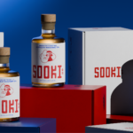
Like, so retro, but so the future
There’s really so little not to love about this branding for Sooki – in fact, I’d go as far as saying there’s nothing not to love. It’s purely, and simply, gorgeous; every goddam inch of it. Kudos, then, to The Collected Works, the New York City- and New Orleans-based independent design studio behind the identity design created to bring Sooki...
BP&O Voices
Packaging:
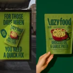
Lazy Food, Big Energy
A guest article written by packaging expert Lisa Cain. BP&O Voices presents the opinions of industry experts on a wide range of topics....
Logo
Conceivable by Firmalt, 2026
Conceivable is an AI-driven, fertility-focused and personalised supplements business, quite a mouthful. Firmalt worked with Conceivable to reposition fertility from a guessing game into a knowing experience. The logo, a ‘C’ shaped around the moment of fertilisation, captures the spark of life within its counter-space. The forward slant lends it a sense of rapidity, and the rounded points softens it...
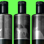
Where fallow deer roam
Deer feel like unlikely ambassadors/ mascots/ PosterCreatures for olive oil, but it turns out they work brilliantly – when, that is, in the superlatively capable hands of a studio like SMLXL. Said olive oil is D’arbequina, a name which more broadly simply refers to the sort of plant from which the oil is produced: Arbequina is a widely cultivated olive...
BP&O Voices
Packaging:
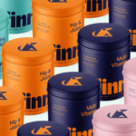
Illustrated Instincts
A guest article written by packaging expert Lisa Cain. BP&O Voices presents the opinions of industry experts on a wide range of topics....

Free your mouth
You don’t really hear the word ‘quip’ all that often – it feels somewhat antiquanted in a way, a little eccentric, somehow very English. The sort of thing gracing the cover of the sort of book someone bought as a gift for someone they don’t really know very well, nor particularly care about – maybe 101 of Oscar Wilde’s Wittiest...
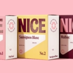
Pink! pink! everywhere!
Wine company Nice started life in 2019, and ever since, has aimed to be a far more straightforward alternative to the wildly confusing, jargon-packed, somewhat stuffy world of wine. In Nice’s words, the whole idea is to “liberate drinkers from wine headaches” both literal and metaphorical, “whether it’s inflexible packaging, confusing labels or next day regret”… Now after more than...
Logo
Fundación Vicente Ferrer by Futurebrand, 2026
The Vicente Ferrer Foundation is a non-governmental development organisation based in India committed to the process of transformation, and the empowerment of the poorest and most discriminated rural areas. The organisation was founded in 1969 and its new logo, designed by Futurebrand, could have easily come from the same decade, no shade, just in that it embodies the modernist logo...
Upgrade to
BP&O Plus
Read more
Logo
Nertik by Mubien, 2026
Nertik is a Spanish energy consulting firm. Mubien worked with Nertik to develop a new strategic direction and visual identity to better convey its offering of helping businesses understand, manage and reduce their electricity and gas costs. The new Nertik logo combines a lighting bolt and an ‘N’, using positive and negative space to find a harmonious resolution of the...
BP&O Voices
Packaging:
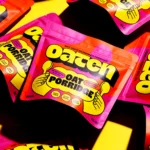
Oat Standing
A guest article written by packaging expert Lisa Cain. BP&O Voices presents the opinions of industry experts on a wide range of topics....
Goofy, playful and knowingly a bit silly
Design systems are often spoken about in terms of those moments of ‘surprise and delight’, but often, there’s little either surprising or delightful to be found. Blurr Bureau’s new brand identity for Yes! Apples, however, is so brimming with surprise and delight that those moments become the entire timeframe here: the Easter Eggs absolutely abound here, for the brand design...