Latest
Read the latest opinion
NoomaLooma by Cotton
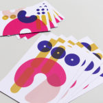
NoomaLooma is described as a “platform built around small moments of making”. As far as I can tell, it’s an app in its early stages (at the moment, it’s just for iPhone), and it’s launched with a brand identity created by New York studio Cotton (the design team behind the excellent identity for Eternal Research). The platform was created by...
BP&O Voices
Packaging:
Take The Punch
Packaging expert Lisa Cain looks at Pond’s work Swedish beer brand The Bear....

Dataforeningen by Bielke & Yang
Dataforeningen simply translates as ‘data organisation’ from Norwegian to English, and funnily enough, that’s exactly what the organisation is. Operating nationwide across Norway serving people working in tech, it was looking for a new identity that reflected a shift in who and what it was, and its future aims. Taking on this potentially tricky brief was Oslo-based Bielke & Yang...

Pumpkin by Kuba & Friends
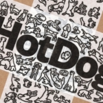
Another week, another branding project for those – love them or loathe them – ‘pet parents’. I honestly thought we were post-pet-parent, but seemingly we’re still very much in the midst of that icky phrasing – the “live, love, laugh” of dogs, a sort of endless bottomless brunch with the #girlies. I’m an ‘elder millennial’, but it all seems disgustingly,...
BP&O Voices
Packaging:
Bar none
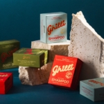
Packaging expert Lisa Cain looks at Allink’s work on solid shampoo brand Ghilli....

Six Six by A Friend of Mine
Six Six is an eyewear store and optometrist based in Melbourne, which opened early this year with the aim to be “more like a destination than a store”. Tasked with creating the brand identity to make that happen was A Friend of Mine, or AFOL for short (Embla, Great Wrap, Suupaa), a brand design studio also based in Melbourne which...
Nu-clear your skin
Juana is a Dubai-based company creating CBD-based “bioactive” skincare, founded by Yann Moujawaz Martini, a French-born entrepreneur with Syrian roots and a background in brand strategy or – as he himself put it in an interview – “a decade designing multibillion-dollar wellness and medical tourism mega-projects for governments and Fortune 500s”, after which, he says, he “flipped the script” and...

BP&O Voices
Packaging:
Top Drawer
Packaging expert Lisa Cain looks at Tatil’s work with Carrefour’s own brand Home....
Off-kilter and elevated
St Paul’s Cathedral is undoubtedly one of the most iconic, recognisable landmarks of London’s skyline: its vast dome, all beautiful copper-tarnished turquoise, resplendent with dazzlingly golden pineapples (one of its architect Sir Christopher Wren’s favourite accoutrements, and back in the 17th century a distinct status symbol representing all that was bountiful and exotic). Until 1963, St Paul’s was the tallest...

Gaptooth Soda by Saint Urbain
One person’s imperfection is another’s luck– especially, it turns out, when it comes to teeth. The front-tooth-gap, as exemplified and celebrated by the likes of Madonna (and, it turns out, Chaucer’s famously, unabashedly lustful “gap-toothed” Wife of Bath) is known in more scientific or medical terms as a ‘diastema’. Many see this aesthetic dental quirk as attractive; others not so...
BP&O Voices
Packaging:
Properly Cultivated
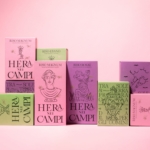
Packaging expert Lisa Cain looks at Multiverse’s work with Italian rice brand Hera Nei Campi....
Discover
From the BP&O archives
Introducing BP&O Plus
Lots of extras. Cancel any time. Read more
Cancel any time.

